With over 200,000 users, Magento has firmly established itself as an e-commerce solution. This platform allows you to build a complete shopping experience, and also gives you the tools you need to personalize content, manage your inventory, and even coordinate shipping.
However, to take full advantage of Magento’s functions, you need to think carefully when designing your site. In this guide, we will look at a page too often overlooked during the design process – the checkout page.
The importance of a well-designed checkout page
Many people think that once a customer has clicked “Buy” or “Add to Cart,” the hard work is done. In fact, there is still one remaining hurdle – the checkout page. On average, two-thirds of customers abandon their online carts. This represents a great deal of lost revenue.
Fortunately, there are lots of steps you can take to increase your conversion rates at this critical moment in the sales process.
1. Be transparent with costs and pricing
Never spring any new costs or fees on your customer at the point of checkout. If you charge for shipping or handling, make this clear in your product descriptions. Otherwise, your customer may become annoyed and click away. The checkout page is a great place to emphasize free shipping and handling – remind your customers that they are getting a good deal.
2. Do not redirect customers to a separate payment portal
Do not send visitors to a new page with a new URL when asking for their financial details – this may make them suspicious of your website. The domain name for both your product pages and checkout pages should be the same. The purchasing process should be as seamless as possible.
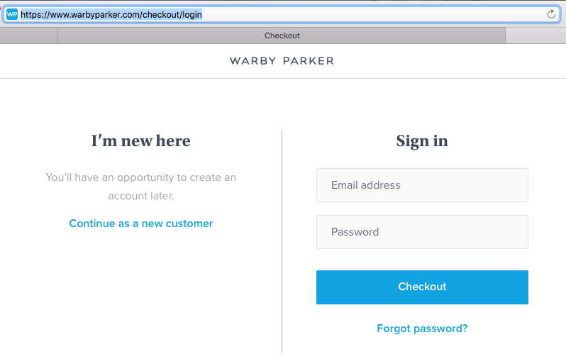
Note that Warby Parker, a glasses retailer, keeps customers on their primary domain during the payment process (warbyparker.com)
3. Always offer a guest checkout option
Research shows that almost 25% of website visitors will leave your site if they are told they must make an account before placing an order. Give guests a chance to make an account once they have completed their purchase. You can entice them to sign up by offering them a discount or early access to new products and services.
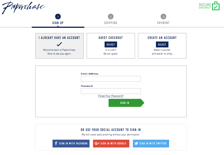
Stationery company Paperchase offer visitors the chance to check out as a guest, to use an existing account, or to sign up for a new account (paperchase.com)
4. Make all form fields as easy to complete as possible
Internet marketers disagree on the ideal length for an online form. There is no rule that works for everyone. When it comes to deciding between single-page or multiple-page forms, it’s best to run a split test to see which works best for your site.
Use asterisks to denote a required field. Configure the page so that a customer doesn’t have to re-enter all their details if they overlook one of these fields first time around.
5. Localize your content if you are selling to an international audience
Even if your international audience can read English, they are more likely to make a purchase if your site – including the checkout page – is written in their language. In fact, 75% of users will not make major purchases unless they can read a product description written in their native language.
However, website localization isn’t just a matter of translating product descriptions into another language; you also need to think about the type of input fields required by customers in different regions. For instance, someone in the US will need to enter a ZIP code for shipping purposes, whereas someone in the UK will need to enter a postcode.
You also need to consider which payment methods will suit your target demographic. For example, credit cards are not commonly used in every country.
6. Use a progress bar on your checkout pages
Place a bar at the top of the screen that shows your customers which stage they are at in the ordering process. This can give them the encouragement they need to keep entering their information, and makes the whole process simpler. Otherwise, they may become bored and, if they suspect the process will be a lengthy one, abandon their purchase.
Fashion and lifestyle retailer Oliver Bonas have created a simple progress bar at the top of their checkout page (oliverbonas.com)
7. Follow up with customers who abandon their carts
Just because a customer decides to forego a purchase now, doesn’t mean they won’t return to your site in the future or come back and make an order. You can add a Magento extension to your checkout page that automatically sends a follow-up email to registered customers who fill, then abandon their carts.
These automated emails can be tailored for a personalized customer experience. You should give them the opportunity to resume their shopping experience and restore their carts with a single click, send coupons that entice them back to your site, or send them a link to a survey that gives them the chance to tell you what they think of your site and products.
Even if they don’t change their minds, you could still get valuable information that can help better optimize your checkout page, and site as a whole, for future visitors.
8. Use a customer’s details if they are returning to the site
Customers value their time and will appreciate it if you can auto-fill the forms on your checkout pages with their personal information. There are numerous extensions available that give your customers the chance to save their information for future visits. You can use such extension that let your customer save their products cart in future if needed.
9. Make sure your page is optimized for mobile
Sixty-two percent of smartphone users have purchased at least one item using their device over the past six months. You cannot afford to overlook mobile optimization. You can use free online services which lets you preview your site across popular mobile devices.
Choose a lightweight, responsive template, optimize image and JavaScript files by compressing them, enable page caching, and carefully evaluate all your website blocks. Delete those you are not using, as these can increase your site’s loading speed. Review your third-party extensions and remove any that aren’t adding functionality to your site, as they may cause it to run slowly.
Put your customer first
Always test your checkout page before making your site live. No matter how much time and effort you put into optimizing your page, there will almost certainly be a few bugs in need of fixing.
Remember the golden rule: You want to give your customers the best possible experience. Make usability your primary concern, and you’ll build a checkout page that will maximize your conversion rate.


