
In a world where every single thing is available on the web, one can order food, grocery, book tickets, pay bills, watch the news, entertainment and whatnot.
What is the most crucial thing that makes the experience of people enjoyable on the screen?
It’s the looks and aesthetics of the website. The look and feel of the website depend upon the website design. However, web design also includes the experience of the users and the performance of the website.
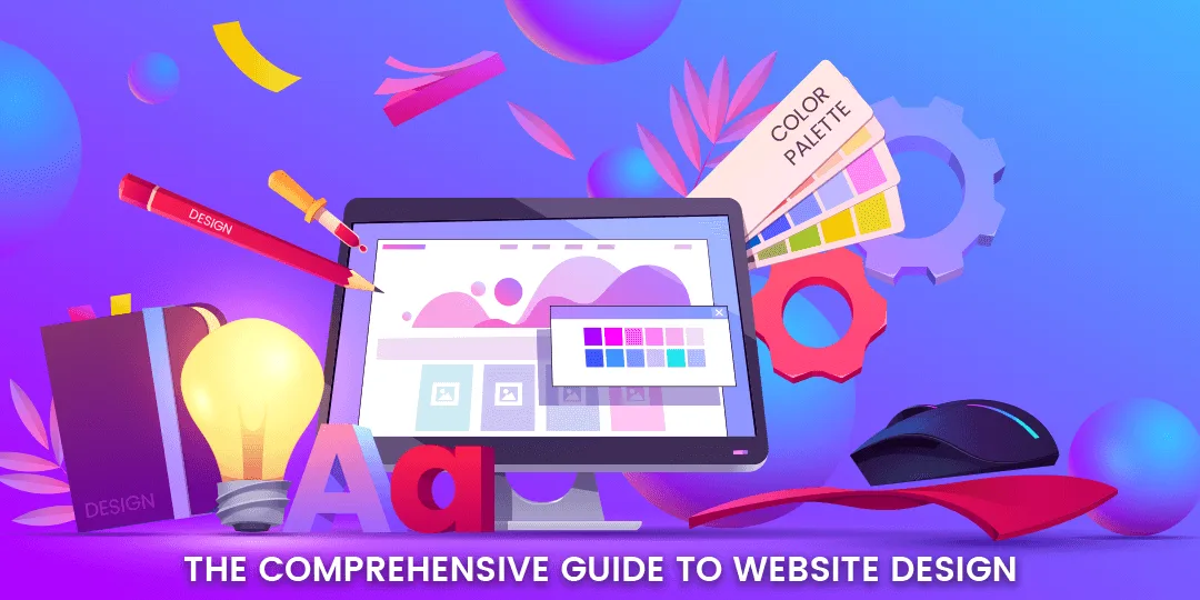
Here I have come up with a detailed guide on web design that encompasses the whole picture of website designing aspects from basics, tips and tools to step by step process of creating a website. This article gives insights on how to design an engaging website that improves search engine rankings. Furthermore, I have also included extra tips that must be considered while designing a website.
Let’s go ahead quickly!
WHAT IS WEBSITE DESIGN?
Web design is the process of planning and building the elements of a website including font, graphics, structure, layout and content. Website design also includes the overall functionality of the website. Website design has various components including website design, website development, user experience, interface design and search engine optimization that work together to create a great user experience. It shows how the website will look and work on various devices.
GOALS OF WEBSITE DESIGN
Before designing your website, you must keep in mind the goals and objectives of your website. The design of the website must fit in with your website objective. The website design must depict the objective you are aiming at. The website design must be in unity with your goals else it will fail.
The goals of website design may include the following:
- Support brand
- Show personality
- Build loyal audience
- Sell products
- Run marketing campaign
- Communicate with users
- Raise awareness
WHY IS WEBSITE DESIGN IMPORTANT?
The design of your website plays the most significant role in your online presence. Your website design must be done keeping in mind your audience and business. The website design must ensure that it provides with a good user experience. A good website design benefits your audience and business both. Let’s discuss the importance of website design from the view of your audience.
Brand Professionalism & Trust
People tend to judge your website based on its design. The modern and professional design shall increase the trust of customers. Improper website design makes your customers doubt your genuineness. Consistency is also very important for creating a good website design. People are more likely to remember your logo, website color, font, images and theme. Keeping these elements consistent across your website design reflects your brand image.
Look at the website of Woodland. They maintain a consistent green and white color throughout the website that shows the brand image and people recognize it with this.

Image Source: Woodland
Color
The color of your brand logo and other elements depend on your brand associations. If you want to build customers’ trust you can go with blue. If you sell high-quality products, black is the best. The website color chosen creates certain emotions and thoughts in people’s mind.
Layout
Well-structured websites are easy to understand and navigate. Keeping website design clean, simple and understandable will draw customers’ attention. Dropdown menus must be categorized clearly. A website lacking a clear grid design becomes messy and disordered. Well-organized websites create a good website design.
Fonts & Typography
The selection of fonts and their color must depend on the background color you have chosen for your website. The selection of fonts must also depend on the type of audience you are targeting. Young people prefer stylish and fancy fonts while ole people require simple and clean fonts that are easy to read. Fonts also reflect the brand identity and show whether you want to show youthful, fun or professional.
Website Accessibility
Your website must be accessible to all. This means designing your website also for disabled people and not just focusing on normal people. This is known by very few designers and developers. We will discuss web accessibility more at the end of this article.
Site Navigation
If people can easily locate the information they are looking for, your site is easy to navigate. If the website navigation is complex, the customer will get lost navigating to find the required product. The more user-friendly the website is, the more quickly the customer can make decisions which will lead to increased conversions.
Conversion
A good website design draws the user’s attention and tells them where to look. The website design must highlight CTAs and easily identifiable buttons and emphasize special offers. These things will make users take action quickly. Using contrast call to action attracts users and makes them look at the conversion buttons.
Mobile-friendliness
In this world, the mobile is the handiest device. With Google moving to a mobile-first approach, having a mobile-friendly is not important but necessary to get found online. Your website may look perfect on a desktop, but the elements look scattered on other devices. Having a responsive website design will look great on the type and size of the devices.
User Experience
Making the user experience of the website better is the key to staying ahead of your competitors. A good website design helps in improving the user shopping experience. This will lead to earning repeat customers. The overall user experience includes easy navigation, quick support, smooth checkout and more.
SEO
A website design is not only how it looks in the front. The backend stuff also plays a role in making the website better. If the website looks good on the outside, but uses very complex code or larger images, it will affect its loading performance. High-loading websites will drive visitors away which will affect SEO marketing.
TYPES OF WEBSITE DESIGNS
The type of website design must resonate with your audience and reflect your idea. Here we have discussed various types of website designs that can help you decide the one that is perfectly suited for your website.

Single page
In single page website design, the whole information of the website is covered on a single page. The page can be as long as you want and the user can scroll down to look at the information. This type of website design is used to show a company’s story, sell products or show the company portfolio.
Static website
A static website has very little or no user interaction. They are created using HTML or CSS with fixed content. Static websites are generally used to convey information or startups that just want to introduce themselves to the web.
Dynamic website
Dynamic websites create active and exciting user interaction. Dynamic websites are created on platforms like JavaScript or PHP. Dynamic websites are user-friendly compared to static websites, which is obvious, but they can cost a bit more money and have longer loading times. Above all, a dynamic website creates an impressive, meaningful, and interactive user experience.
Responsive design
A responsive website design changes its layout according to the size of the screen. The text is wrapped and images are scaled depending on the screen size. Whether the website is opened from a desktop, tablet or mobile device, the elements are viewed the same. This type of website design is beneficial to organizations as the users can browse through the website content from any screen.
Liquid design
Liquid design behaves similarly to responsive website designs. The only difference is that the percentage of the screen will either shrink or expand the elements of the website. Whenever a browser screen is resized, the content columns are increased or decreased accordingly.
Fixed design
In a fixed website design, the content doesn’t change no matter what the size of the screen. If the browser screen is zoomed in or out the website content remains the same. The text and images fall apart from the screen when the browser screen is enlarged or reduced. These types of websites when viewed from a smartphone or tablet, the user has to zoom in to read the text.
Conceptual and Experimental Website Designs
Conceptual and experimental website designs push the limits of modern technology. They use advanced features to provide a distinctive user experience. It includes websites like games or virtual reality. They provide an incredibly awe-inspiring experience to the users. But with this type of website, problems like lower browser compatibility and require several resources to run smoothly.
TYPES OF WEBSITE LAYOUTS
A website layout is a way in which the visual elements are arranged. Through this, the website enhances the website usability. The layout can also enhance website design and create user interactions. Here is the list of website layouts you can use for your website.
F-shaped Layout
The F-shaped layout of website design is the general viewing pattern of users. According to scientific research, the user moves their eyes in an F or E shape while looking into the webpage. Websites designed in this type of layout can capture the user’s attention. The F-shaped layouts are most used by news sites or search engines that provide a lot of options for users to choose from.
Z-shaped Layout
Z-shaped layouts are similar to F-shaped layouts, but the difference is that Z-shaped layouts target a different set of users. A scientific study says, people from western cultures, see the website in a Z shape. This type of website layout is most used when the website focuses on a single goal like wanting customers to sign up for a service or purchase a product.
Grid of Cards Layout
This type of layout displays the website information in a grid format. The grids are adjusted accordingly when the screen size is changed. It is more suitable for video streaming websites that show thumbnails of the videos and the user can easily search for what they want.
Boxes
The boxes website layout is designed in a way that displays a big box on the header and two small boxes underneath it. The boxes hold important information about the company or featured products. Each box redirects customers to another dynamic page, where the user can look into detailed information.
Split Screen
As the name suggests, the split-screen divides the website information into two sections. This layout is suitable for websites that focus on selling both types of products. For example, a clothing brand sells clothes for both men and women. Using split-screen, they can show both categories on the home page and the user can select what they are looking for.
Fixed Sidebar
It shows a fixed menu bar on the left or right side of the screen with different options. The sidebar layout allows the users to easily explore other areas of the website with quick links. This type of website layout is appropriate for websites with less information and those that sell a single product.
Magazine
The magazine website layout looks like printed publications. It contains columns and grids to help viewers read through the website easily. It shows how the document will look when printed. Magazine layout is mostly used by publication companies to create an engaging experience for users.
Asymmetrical Layout
It shows the irregular design of the website where one part is larger than another one. This type of layout is often used by companies and organizations on the website homepage. Say for example the bigger section shows an attention-getting line while the smaller section allows the user to fill in the information.
Featured Image
In the featured image layout, the website put a large image on top to seek the user’s attention. In the featured layout, the popular products of the company are shown that encourage users to make a purchase.
Curated Visuals
Curated visuals are shown with illustrated images of a product or service. This layout is used when you want users to feel the same emotion that your website delivers. Companies selling complicated goods or services can use curated visuals for a better understanding of customers.
WEB DESIGN TOOLS
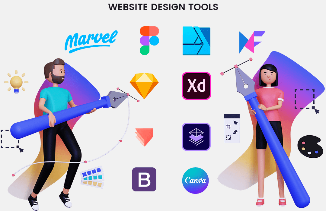
With web design tools, you can bring your unique ideas to reality stress-free. Here are a few best web design tools in 2022.
Sketch
A sketch is a vector-based tool to design websites and apps especially. It is a commonly used web design platform to build interfaces and prototypes. It helps keep a consistent interface with UI and an inbuilt grid system. The only drawback of the sketch tool is that it is only available for Mac. So the designers find it difficult to share .sketch files with windows developers.
Adobe XD
Adobe XD is a powerful tool under Adobe Cloud. It helps create web, app, brand and game designs. It’s one of the best prototyping software for Adobe users. Adobe XD can seamlessly integrate with other Adobe software like Illustrator, InDesign, and Photoshop.
Marvel
Marvel is an ideal tool for creating and refining the user interface the same way you want it and building prototypes. User testing is a unique feature provided by Marvel which is rare in web design tools.
Figma
Figma enables the collaboration of multiple designers at a time. So if you are working with other designers on a project, Figma is a perfect tool for you. It supports real-time feedback from clients that makes design updates easy.
Affinity Designer
The main advantage of Affinity Designer is that it offers 10,00,000% zoom. Also, the user can go 8,000 steps while working with the tool. Furthermore, it includes features like adjustable and non-destructive layers.
ProtoPie
ProtoPie allows the creation of complex interactions with a no-coding-requirement. The main feature of ProtoPie is its ability to control smart devices like compass, sound, and touch sensors. It’s an ideal tool for those who want to cover native app features.
MockFlow
Mockflow is an online wireframing and website layout tool. It has various templates so that the designers need not start every project from scratch. It has lots of in-built components and layouts that can be used as per your requirements.
Adobe Comp
Adobe Comp is a useful tool for iPad that supports the creation of prototypes, wireframes and layouts for web pages. It provides you with layouts for web and mobile that can even get printed. Adobe Comp possesses features like easy-to-use, great UI and powerful capabilities.
Bootstrap
Bootstrap is popular for building mobile-first responsive websites. It simplifies the process of website creation with HTML and CSS libraries for free. It has dozens of components that make coding easy and quick.
Canva
With the help of predefined optimized templates, Canva helps create quick images. The drag and drop functionality with graphics content makes it a go-to tool for everyone. It is an ideal option for creating social media images, business cards, invitations, flyers and presentations.
WEBSITE DESIGN CHECKLISTS
Before designing a website you must take care of a few things to get a terrific web design outcome that perfectly goes with your brand voice. Verify the below website design checklists.
Typography
Typography means how the text will look on the website. Use a readable font type and font size for your website content. Use a hierarchy to make the content more digestible. Use standard fonts instead of fancy ones. Use font colors carefully and avoid animation of the texts.
Choose color as per your industry/brand
Select a color based on what message or emotion you want to convey to customers. If you have a meditation website, it’s good to use light and soothing colors. Don’t use too many colors in your design. Too many colors will make users confused about what your site is trying to deliver.
Use white space
Adding sufficient white space between the texts and paragraphs will make the content readable. White space between header and paragraph must separate them both to better know the difference. White space makes the user interface better.
Use texture
Textures are used to attract the user’s eye. To bring certain elements into the spotlight, textures can be used. Make use of textures where you want users to pay attention. You can also showcase brand identity with the help of textures. Textures can make your design stand out.
Add images to engage and inform readers
The image speaks louder than words, is a true saying. Images can highly capture the user’s attention. A good image with appropriate text can help visitors better understand the product. Use relevant images for your product or services. Use clear and optimized images that convey a suitable message to the viewers.
Simplify your navigation
Navigation is the key element of any website. If the visitors face problems navigating your website, they are more likely to leave. The navigation on your website must be simple, clear and consistent. Make important navigation options permanently visible so that users are easily able to find them. If you have a larger website, show breadcrumbs so that the user knows where they are.
Make your CTAs stand out
Call-to-Actions (CTAs) are buttons that guide users towards a conversion point. CTA buttons must be large enough to attract user attention. Moreover, the color of the button must be chosen in contrast with the webpage background to increase engagement. Keep white space around the CTA button to separate it from other elements and use relevant labels for the button.
Optimize for mobile
It’s very important to optimize your website for other screen resolutions like mobile or tablet. Mobile-responsive websites are prerequisites in this digital era. As people have to tap on the mobile screen, the interactive elements must be big enough so that users can easily tap on them. A website must be visible perfectly on any screen size.
Limit the options presented to users
The number of choices affects the decision of users. The more choices they have, the less action they will take. Providing with many options will make users think too much. So to increase interaction, offering limited options is a good idea.
HOW TO DESIGN A WEBSITE IN 2022 [Step-by-Step Tutorial]
Designing your website seems like a difficult task. But with the help of the right tools, tips and resources, you can learn how to create a website from scratch. Follow the below steps to get a great design for your website or hire a professional designer to skip the below steps.
STEP #1: Determine Your Site’s Objective
The first step in designing your website is to find out the aim of your website, the reason you are creating this website and the way you want to function your website. You need to consider your Unique Selling Points (USPs).
There are different types of websites available.
- eCommerce store
- Portfolio
- Landing page
- Personal blog
- Event site
- Resume
- Brand website
Each type of website will have different pages, layouts and elements.
STEP #2: Select Your Domain Name
As you have an address of your home, the same way the address of your website is the domain name which is the most important thing. You must choose a domain as per your industry and market niche. A proper domain name would be an important factor for site attractiveness. You can use a business name finder for finding a proper domain name. Furthermore, its name checker tool will show you if your preferred name is available as a domain and on the social networks you want to use.
Tips for choosing a Domain name
- Don’t use numbers, hyphens or characters within your domain name.
- Keep the domain name short to avoid misspelling.
- Use keywords in your domain name based on your business name.
- Choose the extension of your domain name targeting your area.
- Secure your domain to build your brand and customer trust.
Purchase a domain from a registrar and then you need to host your website. Check the Top Hosting Providers.
Make sure that you renew your domain name every year.
STEP #3: Select Your Website Platform
The next stage is to decide on the platform for your website. While choosing a website platform, you should keep in mind what you want to accomplish with your website. Various website platforms focus on different niches. Some are suited for eCommerce, some focus on security.
Some well-known website platforms are:
- Magento
- WordPress
- Shopify
- BigCommerce
- Shopware
- PrestaShop
- Wix
Check – Top eCommerce Platforms in India
STEP #4: Select Your Theme/Template
Now you have your website platform in mind, look for a template or theme. The theme is the layout of your website. Most of the platforms offer pre-built templates based on industry. You may also need customization to fit business needs.
At the time of theme selection for your website, look for the below criteria:
- Design
- Compatibility with plugins
- Fast loading times
- Up-to-date development
- Responsive design
STEP #5: Create Your Site Map Structure
The site map determines the number of pages you need to create. The importance of creating a site map is so that you know what your website will cover and you don’t go blind with it.
A general structure of a sitemap includes:
- Home page
- About us page
- Category page
- Product/Services page
- Blog
- Contact page
Each business requirement is different so make sure you cover all the features and useful pages on your website site map.
STEP #6: Write Your Website Copy
You can start writing your website copy, once you know which pages you want on your website. Website copy must attract customers to your website so that they take action and work with you.
Tips to write conversion-driven website copy:
- Know your audience
- Know your competitors
- Help reader navigate (content written in proper flow)
- Add visuals
- Keep it short and concise
- Bold important words or phrases
- Include keywords (synonyms/semantic search)
- Create calls-to-actions (CTAs)
- Add interactive experiences/content
STEP #7: Launch Your Website
Whoopee! You did it! You have finished designing your website and now it’s time to launch it. Publish your site and start marketing your business.
Points to be considered after launching your dream website:
- Regularly create and publish quality content
- Buy secure, scalable website hosting with good tech support
- Implement the best content management system
- Install webmaster tools like Google Search Console
- Link to your social media profiles
- Implement a website maintenance plan
ADD-ON TIPS FOR WEBSITE DESIGN
Core Web Vitals
Core Web Vitals are a ranking algorithm by Google that works on the performance of the pages of a website that are important for the user experience. It is made up of 3 factors: Largest Contentful Paint (LCP), First Input Delay (FID) and Cumulative Layout Shift (CLS).
- LCP is the timespan to return the largest element of the page from when the user requests a URL. Less than or equal to 2.5s is a good score for LCP.
- FID is the duration of time between the user interacting with your page to the response of the browser for that interaction. Less than or equal to 100ms is a good score for FID.
- CLS is the stability of the page when it loads. Shifting of the elements while loading creates a bad user experience. A good score for CLS shall be zero to 0.1.
Hence, by designing your website based on the Core Web Vitals factors, you can win the game of SEO and improve the user experience.
Know more about Core Web Vitals and its importance for eCommerce
Web Content Accessibility Guidelines (WCAG)
What is WCAG?
Web Content Accessibility Guidelines (WCAG) is a set of guidelines for improving web accessibility. It is the way to make your website useful for all users, especially for people with disabilities.
Principles of WCAG
Following are the principles of WCAG 2.0:
- Perceivable – This principle is about the senses of the people. Senses of sight, sound and touch are considered here. Your website should be perceived by all users.
- Operable – This principle is for users with motor difficulties. Some users may operate websites with a keyboard. Allow keyboard navigation, avoid time limits and apply auto-corrections on forms.
- Understandable – Your website must be understandable by users. Making a website perceivable and operable, but if it is not understandable, it is of no use. Use simple language and simple instructions.
- Robust – Your website must be designed keeping in mind the web standards that work on various platforms.
Benefits of WCAG
There are several benefits of applying WCAG guidelines to your website.
- Improved usability – Web accessibility not only makes the website accessible for users, but also improves website usability and user experience in the long run.
- Brand building – Designing your website based on WCAG will show that you care about all groups of people and you get positive reviews from the the website visitors.
- Better SEO – Making a website accessible improves the chances of higher search rankings. This drives more traffic to your website.
- Higher revenue – Adding accessibility features to your website will result in greater sales and brand loyalty.
Conclusion:
Website design is a continuous process. The above guide can help you get a good start and improve your website in the long term. Keep a track of your analytics and take user feedback into account to refine your website design.
Consider the user and his perspective in mind while designing your website. Hire a Professional Web Designer to get an ideal website for your business.

What a helpful guide for website design! You noting that a site map structure must be developed is super helpful for better optimization. I love tools that really have great website wireframes especially since they really help with the structure and making sure that the flow of pages are perfect for the user.
You explained the topic very well in detail. Very good site
This blog is so detailed and valuable, especially the checklist, people don’t go so clear on that, but they should. So what do you do to create a perfect website? Should a company hire any expert agency for it?
great content about designing a website.
This article is very amazing.
Good job.
Keep on posting.
I really enjoyed this blog post.
I find it very informative.
Keep it up
It’s a beneficial and informative article.
Keep on posting.
Thanks for sharing.
You explained the topic very well