
E-commerce has turned the retail world upside down and transformed shopping habits globally – so much so, it’s now even impacting long-established traditional retailers and, in many cases, causing the demise of some of the best-known stores.
Almost without exception, today’s most successful retailers have adapted and changed to newer shopping trends and embraced tech by branching into online sales. The web offers unrivaled reach and scalability of operations that simply wasn’t possible in the pre-internet age, and today’s e-tailers (big and small) can now reach new customers locally, nationally, and even internationally.
However, while selling online certainly offers unique opportunities, it also presents specific challenges far different from those encountered in a traditional brick-and-mortar shop setting. With no physical contact and no real-world salesperson to encourage purchasing, e-tailers have to pay specific attention to making their e-commerce stores as functional and easy to use as possible.
The importance of User Experience (UX)
While some internet users may have a loose understanding of User Experience (UX) design, far fewer would be able to explain what it entails, and for good reason. When you’re browsing the web or using an app, it should be as simple as possible to find information, order goods, or just generally interact with pages. In truth, most people never consider UX when they’re using tech.
Indeed, it’s only when these processes become difficult that the typical internet user will begin to consider why – or, in real terms, start thinking about their User Experience. As with so many other areas of life, it’s often the case that we only notice things when they’re substandard rather than when they’re good. UX is exactly the same.
The simple equation – make a site easy to use and you’ll get more clients
There’s nothing worse than trying to navigate a confusing or unwieldy site that leaves you frustrated trying to get where you want to be or learn what you want to know. Good UX encompasses many factors, but, at its most basic level, a site should be easy to use and navigate, regardless of a user’s particular experience of websites or, indeed, specific subjects.
When a visitor comes to your pages, they should get an immediate impression of who you are, what you do, how you can benefit them, and – of particular importance when it comes to e-com sites – what products you sell and how they can buy them. There’s little point in burying information under confusing layers or hidden in complex navigation structures – rather, the information should be clear, simple, and easy to find.
Rule 101 of good UX – look at your site through different eyes
Very often, website architecture is determined by the client rather than the web development firm – which is almost always a recipe for bad UX design and navigation. Sure, the client (i.e., the business owner) needs to have input to design features, navigation trees, and layouts, but – in almost all cases – they approach things from the privileged position of having a deep understanding of their business, goods, or services which frequently leads to skewed or complex website structures.
Ways to check for UX problems
If you want to get an idea of how well your site operates, you should ask a friend who knows nothing about your firm to look over it or, better yet, enlists the help of a professional development firm to perform a full audit on your site. While you might think your pages are easy to understand and navigate (due to having the inside knowledge noted above), you may be very surprised when someone else tries to find their way around.
You should also install Google Analytics (or similar reporting systems) on your site to check for stalling points or pages where people leave. Exit points very often give a clear idea of problem areas on your site or its navigation.
The basics of UX
As mentioned above, good UX encompasses so many factors that it would be impossible to list them all here; however, as a basic guide, good UX should include:
Easy navigation
In a fast-moving world, most users don’t have the time or the inclination to waste useful minutes or hours trawling your site when they can instead click back to Google and get thousands or even millions of other options. At the base level of good UX is a simple and easily-comprehensible navigation structure. Improve your website navigation by integrating Breadcrumbs Extension for Magento 2. As a rule, you should put your most important items at the top of this navigation tree – or even as direct links on your home page. Note, this applies equally to your most popular products.
Speed of transactions
Your site should be easy to navigate and quick to load, but the purchasing process also needs to be speedy. Unfortunately, with the continued rise of cybercrime, it’s often quite difficult to streamline the buying process but try to look for ways to minimize the number of pages a user might have to navigate and the amount of form-filling they have to do to complete their purchase. You should also employ modern security practices like understanding KYC to reduce the chances of fraud while also protecting yourself and your clients.
Language
Just as in real life, using confusing or jargon-heavy text on your site will only serve to confuse or alienate them. Instead, you should focus on keeping the language clear, simple, and easy to read – including using short sentences.
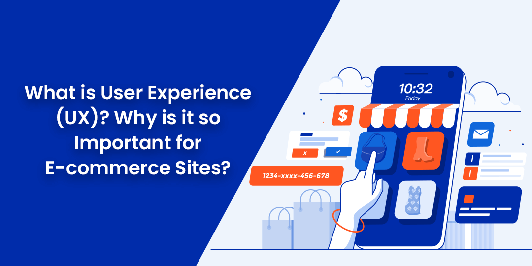
Why is Good UX so Important for E-commerce Sites?
It’s estimated around 71% of all consumer journeys these days start with an online search – whether just for research purposes or to find and buy products. The web has democratized the selling process meaning firms big and small can compete on a level playing field and be found by clients all around the world.
However, while the internet and, in particular, search engines have made it much easier for firms to be found if your site isn’t easy to use, visitors will simply click back to the Search Engine Result Pages (SERPs) and very likely never return. In a worst-case scenario, they may even head directly to one of your rivals.
Boom – in one split second, you’ve lost the sale and possibly an ongoing client relationship – and all because your site was difficult to use or navigate.
Happy Reading!


Without any doubts, e-commerce has affected the retail world to a global extent and has opened a huge range of possibilities to people. I am impressed by this kind of commerce because it has a lot of advantages and it has affected not only the retail world, but also the whole world in general because it forced us to look at many things with different eyes, reconsidering them. Despite this fact, not many people are aware of such a term as “User Experience (UX)” and its meaning in our lives. To tell the truth, more and more companies are starting to pay attention to UX, realizing the impact it can have on their long-term commercial success because UX plays a truly valuable role in running online business. I think that it is essential to take all these factors into account to refine your UX and make it as effective as possible, benefiting your online enterprise.
Hi Gaurav, this was a great read!
I especially loved your views about how good UX can improve the business aspects of an eCommerce business. It was so well put that someone with limited experience in UX would be able to grasp it too.