Before moving further with the blog, there is a question you need to answer, which is;
According to you, as an eCommerce store owner, what is the most common reason that customers abandon your store within a few seconds?
- Slow-loading website
- Complicated Checkout Process
- Complicated Navigation
- Low-quality product images
- All of the above
The answer to this question would definitely be option 5.
As per a survey, 71% of website visitors abandon an eCommerce store because of the store’s poor user experience, whereas complicated navigation is responsible for 37% of higher conversion rates.
With these statistics, you can conclude how important it is to implement the right features into your website to make it user-friendly and take your business to great heights.
Whether you’re just starting your online store or you have an existing website and are thinking about a full redesign, you will want to make sure you understand the essential must-have website features that will give you traction and provide you with some level of differentiation in a very competitive marketplace.
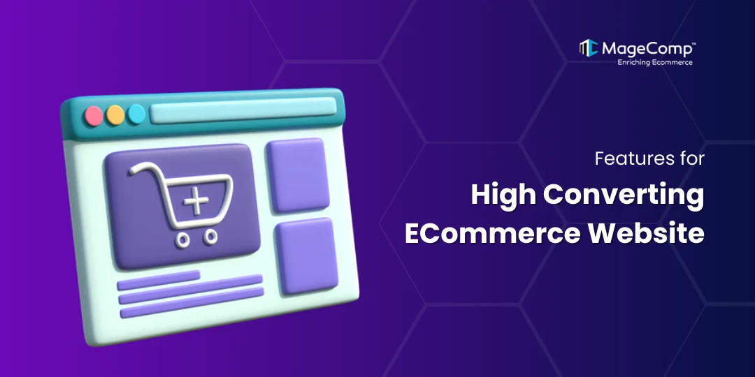
Here are the must-have features to make your eCommerce website a sales magnet:
1. Easy Navigation
The navigation for your website should be simple, intuitive, and consistent across all pages. Menus should be easily locatable and clearly labeled; think mega menus, dropdowns, and logical categories.
Customers should be able to get where they want to go in two to three clicks. Good navigation will lower bounce rates, help your customers find products more quickly, and increase your conversions.
If visitors get lost, they will leave. Therefore, your navigation should ensure that visitors can shop without effort rather than feel like they are navigating a maze.
2. User-Friendly Site Search
A robust site search capability assists users in discovering what they need quickly. You should include autocomplete, recommendations, and typo tolerance. This functionality is a big help for large product feeds.
Search users tend to have high intent to buy, and reducing friction means more revenue. Search filters and predictive results are a bonus. Don’t forget – your search shouldn’t just be functional, it should be fast, quick, and precise!
3. Breadcrumbs
Breadcrumbs assist users in knowing where they are on your website and help them navigate backward easily. This feature is especially important when there is a long category path for the product the user is browsing. Breadcrumbs give users an easy sense of usability and SEO because users can travel to the exact location in the site structure.
For example, “Home > Men > Shoes > Sneakers” tells users where they are in the site structure, and with a click, they can navigate back. Context matters, and breadcrumbs give the user a sense of control over their experience; keeping users oriented lowers frustration and helps keep users engaged with your products longer.
4. Product Filters
Product filters help shoppers limit their options by size, color, pricing range, ratings, brands, and more. At the same time, optional filters are essential for stores that provide them, etc. Filtering is also useful because it removes a degree of decision fatigue by allowing users to customize the catalogue based on their preferences.
Your filters need to be easy to retract after use, simple to reset, and visible at all times. A clean filter system enables users to stay engaged and find relevant products faster, eventually leading to the product they are most likely to buy, making it a direct driver of conversion.
5. Product Sorting Options
By providing sorting options for your products, you are giving your customers the ability to control how they view products – by price (low to high), by popularity, by newest, by their ratings, and more. This gives the end user a better experience, and it helps users find what is important to them.
Sorting is particularly important on category and search results pages. A good sorting experience feels like customization and personalization, which means less frustration and a higher chance of converting to purchase.
6. Size Chart
A clear, detailed size chart adds certainty and lessens returned items. It should be available on the product page, ideally as a pop-up or modal window, so customers are not taken away from the page. It must also contain measurements in both units (inches and cm), fit tips, and clothing sizes for models if possible.
Bonus: Sizes converted to other countries. The aim is to give shoppers confidence in their sizing decision. The more reliable your size chart is, the less likely it is that an abandoned cart will occur because of uncertainty around sizing.
7. Product Recommendations
Intelligent product recommendations improve average order size and user experience. Recommendations can be based on algorithms that display related products, product bundles of “frequently bought together” items, or customizable “you may also like” sections that are dynamically relevant to the user based on browsing or purchasing history. This encourages longer browsing and discovery of more products.
When recommendations are executed correctly, they can feel helpful instead of pushy, and they can certainly drive upsells and cross-sells.
8. Trending Products
A “Trending Now” feature, showcasing popular or “hot” products, adds machinery to boost credibility and urgency. We humans love what is popular, lest we miss out on something everybody else is experiencing. Your trending feature can be dynamic or static, being updated daily or weekly based on views, purchases, shares, etc.
You can place the trending section on the homepage or on product pages to steer uncommitted shoppers toward other customers’ proven winners.
With snippets of popular, ready-to-purchase, curated products, you can easily create a compelling presentation, increase visibility for those products already moving units, drive conversions with a social proof focus, and capture the customers’ attention.
9. High Quality Product Images
It’s a non-negotiable—you need clear, high-quality images of your products. Shoppers online can’t touch or try on products, so visuals must carry the weight. Show multiple angles, in real use, close-ups, and also some lifestyle images.
You will want to keep the lighting and background consistent and maintain consistent sizing across your entire store. Customers need to feel they are holding the product. Blurry images or low-quality images destroy trust and will hurt conversion. Good images inspire confidence, and customer confidence can directly influence buying decisions.
10. Product Zooming Option
A zoom function allows your customers to view the details of a product, such as the texture, stitching, or small print—an essential feature for apparel, accessories, or electronics. It allows the user to feel more confident by creating a tactile-like experience, making the product feel a little more “real.” The hover-to-zoom or click-to-expand option is best.
Avoid clunky tools that require too many steps and may inhibit the user’s exploration of the product. The closer customers feel they can look at an item, the more confident they are when making a purchase. This small feature can have a big impact on conversions.
11. Product Variant Swatches
Variant swatches help customers quickly view and select product variations (colors, patterns, styles) without having to leave your product page or select from a drop-down. Whether it’s different colors on a shoe or different patterns on a T-shirt, swatches have been shown not only to increase the visual experience but also reduce clicks. Both are great to have.
Just make sure they dynamically update the main image and are clearly labeled. It’s all about speed and clarity; swatches help make customer decisions faster, meaning they have an easier and more enjoyable overall experience.
12. Detailed Product Description
A product description should never be thought of as filler—it is a conversion tool, plain and simple. When writing a product description, make sure your writing goes beyond simply logging the basics.
- Highlight the benefits, use cases, features (what is unique about the product), materials, and care instructions.
- Try to use formatting that makes the description user-friendly. Structure it with bullet points, short paragraphs, and headings.
- Avoid generic marketing fluff that is just vague and irrelevant.
- Focus on what matters to your customers.
Ask yourself, “Why should I buy this and not something else?” An excellent product description anticipates what a customer will ask, or may need to know, and gives that information directly in the description. This helps build confidence in the product, reducing buyer’s remorse at the point of purchase.
13. Sticky add-to-cart button
A sticky add-to-cart button remains visible as users scroll the product page, which is especially helpful on mobile. Do not create extra friction; let customers act immediately when they’re ready without having to scroll back up.
It’s a simple but powerful UX feature that can increase conversions of long-form product pages with a lot of information.
Keeping the act of buying always in view gently encourages the customer forward without being overbearing.
14. Multi-language Support
When targeting international markets, a multilingual site is essential, but it’s important to go beyond just translation and understand cultural fluency. You will also want to localize: Currency, units, formats, and even idioms based on the user experience you’re providing.
You can auto-detect the users’ location or simply provide them with language options when they first reach your store.
A fully functional and properly implemented multilingual feature will remove obstacles to purchase and signal to global customers that your store was built for them.
Don’t let language be the reason a customer bounces.
15. Store Locator
If your business has physical locations, then you absolutely need a store locator. It helps customers easily find your closest store using their zip code, GPS, or city search. Including hours, phone number, and services provided at each location is essential.
It would have to integrate with Google Maps to be optimal. A sleek store locator will drive foot traffic to your location(s) and create an omnichannel shopping experience, i.e., “buy online, pick up in-store.” It adds trust and availability to your brand.
16. Live Chat Support
Live chat provides customers with immediate answers, which reduces hesitancy and can increase conversion. Customers can have questions about a product, its shipping or need help checking out.
Instant chat improves the customer experience by addressing customer questions in real-time. You can use automation to handle common queries, but have a human on standby.
The most important aspect of customer support via live chat is the response time. If chat takes too long, it’s no better than not having live chat.
Establish a place on your page that is easily visible and consistent. Live chat is more than just customer support. It’s a conversion tool that can turn a customer into a sale in the moment.
17. Shareable Wishlist on WhatsApp
Give users the ability to share products over WhatsApp or save them to a wishlist with a single tap. It’s about convenience, and viral spread—users will share products with their friends, or come back and buy later.
WhatsApp sharing is even more valuable in markets where it is the preferred messaging app. Wishlist features improve decision-making and retargeting.
These options minimize friction, give time for users to extend their engagement with the product, and provide more opportunities for future marketing touchpoints. They’re easy to add, but make a big difference to conversions.
18. Customer Reviews
Reviews and testimonials help build trust, and you should highlight these on the product pages or even in a page or section just for reviews and testimonials.
Real feedback from actual buyers is valuable in reducing uncertainty and adding trust.
Look for ways to show as much detail as possible, and display star ratings, user photos, and filters to highlight the most helpful or recent reviews.
Don’t hide negative reviews; openly address them. Real testimonials elevate trust, and trust is the backbone of conversions.
Let your happy customers do the work of selling for you; it’s easier than having to come up with any sales copy!
19. Call to Action Button
A clear, compelling call-to-action (CTA) leads users toward conversion, whether it’s “Add to Cart,” “Buy Now,” or “Check Availability.”
It needs to be clear and visually distinguishable, as well as action-focused. Color contrast, concise consumable language, and general placement should work together to make the CTA impossible to miss.
Do not use generic labels; be specific. Every page of your website should have a purpose, and your CTA needs to help move the customer one step closer.
Finally, a weak CTA means lost sales, no matter how good the product may be.
20. Coupon Codes
Coupon codes provide a quick and effective way to boost conversions and purchases; along with this, they also act like rewards for first-time buyers and help businesses re-engage with the cart abandoners.
Coupon codes can be offered at checkout, via email, or through pop-ups. Make coupon code entry clear and as easy as possible for a potential buyer to access; don’t bury the coupon code or discount in a place that might miss visibility.
Provide transparency about coupon eligibility (min order, products eligible for discount) as early as possible to avoid buyer frustration.
Just remember, if you go coupon crazy, people may wait just to buy at a discount!
21. Out-of-Stock Notifications
Out-of-stock notifications help customers stay engaged with your website instead of leaving it whenever they come across a product that is out of stock.
Letting your customers subscribe to your back-in-stock alert notifications increases your brand recognition. Besides this, it also has the potential to increase the email data for the store to send alert notifications and future marketing purposes.
Additionally, it is a great signal to keep in mind when re-stocking priorities. Otherwise, you are just silently losing customers and sales. By using back-in-stock alerts, you are keeping demand alive, engaged, and measurable.
22. Multiple Payment Options
Each customer has a favored method of payment, whether it’s a credit or debit card, PayPal, Apple Pay, Klarna, or any variety of local gateways or methods of payment.
Providing all of these options will remove that friction at the checkout stage for many of your customers and also widen your appeal on a fragmented and global scale.
If you don’t provide the preferred method, you can lose a sale in an instant. Clearly lay out the methods of payment offered well in advance of the customer actively checking out, and ensure your payment method is secure, quick, and mobile.
An amazing product with limited payment flexibility is still a lost opportunity.
23. Order Tracking
Enhancing your customers’ post-purchase experience is very important.
A real-time order tracking system helps assure the customer and minimizes support tickets for the customer support team. That should allow your users to track orders in any way they prefer, whether it’s by email, SMS, or from your site with an order number. And make sure you give the user clear status updates and notifications to let them know if the order was processed or shipped, out for delivery, or delivered.
24. Email Sign-up Form
An email sign-up is a simple and effective way for you to build your marketing list.
Offering something in return, such as discounts, early access, exclusive drops, and helpful guides, is a great incentive for users. Make it short (name + email is fine) and notice, and have it on your homepage, footer, or pop-up email form (timed).
Don’t spam, let users know what they are signing up for. Once your users are on your list, you can use this great list to update them on new products, remind them of items in their cart, and inform them of promotions. Email is still one of the great ROI channels.
25. Simple Checkout Process
A simplified checkout experience cuts down on friction by reducing fields, enabling guest checkout, auto-populating known information, and keeping the users on a single page if possible.
Each click is a drop-off risk. Make your checkout progress clear with steps or indicators, and also allow for edits without starting over. Clean layout, fast load time, and mobile optimization are a must.
A great in-store checkout experience can be the make-or-break factor in turning that potential sale into a sale—literally.
26. FAQ Page
An effective FAQ page addresses shipping, sizing, returns, product usage, and policy questions before a question arises from customers. It establishes credibility and trust with potential customers and takes some of the pressure off your team.
Organize it into categories for easy scanning, keep brief but informative answers, and hyperlink to related pages when relevant to help customers do their research.
A good FAQ alleviates concerns, which are often the barrier to purchase. If you think of the FAQ as your quiet salesperson answering questions in the background, you can put your mind at ease.
27. Refund Policy
A clear, fair return and refund policy builds buyer confidence. If your policy is unclear or hidden, people will bounce. Be open and upfront: tell customers the timeframes, refund conditions, returns steps, and who pays for shipping.
A liberal return policy might lead to higher first-time return rates, but it builds trust, and there’s value in that in the long run.
Provide this information on product pages, FAQs, and during checkout. Shoppers want to know: “If this doesn’t work out, what happens?”
28. Auto-filling Details
This feature lets customers check out smoothly with the data saved from their browser or their account. This helps reduce errors, drop-offs, and frustration, especially on mobile devices.
Auto-complete for shipping, billing, and contact info makes the experience so much better.
Make sure you are labeling form fields correctly so browsers and password managers can effectively do their job.
29. About Us Page
An About Us page is more than just a history. It is also a trust builder. Tell your brand mission, values, and what sets you apart. Emphasize real imagery, founder quotes, or team stories to personalize the brand. People prefer to buy from people, not anonymous brands.
Make sure it is authentic and customer-centric, less “we’re awesome” and more “here’s how we serve you.”
When done correctly, it drives loyalty, credibility, and emotional connection, all of which are essential for converting first-time buyers to lifetime customers.
30. Local Pickup Option
Providing local pickup to your customers provides them with the flexibility to get their items the way they want, and can also save you shipping costs.
For small or hybrid business plants, this may be even more valuable, as it gives buyers who want speed, convenience, or to avoid delivery fees another option.
Make sure your customers are aware of the pickup at checkout, provide estimated pickup times and directions, or talk about your store hours.
If you have a customer nearby, this may be the determining factor. It is also a good way to get customers into a store and build connections to the local community.
31. Instagram Feed Integration
Adding your Instagram feed is a great way to inject visual momentum and social proof into your site. You could feature live posts, tagged photos of customers, or influencer content.
It keeps your site fresh and alive without constant manual effort on your part. When users see others using your products and enjoying them, this builds credibility and FOMO.
You can always link the posts directly to products for an easier shopping experience.
A clean and curated feed will look better, add to your brand’s vibe, and make visitors more inclined to follow you to build traffic and trust with your audience.
32. Upselling and Cross-selling
Upselling shows higher-value products; cross-selling, on the other hand, shows complementary products. Both strategies help you raise your average order value without needing to drive additional traffic.
Guide your customers to add-ons (e.g., accessories and bundles) on your product and cart pages.
Keep the recommendations relevant and don’t overwhelm your customers. Use clear language, like “People also bought” or “Complete the look.”
These strategies lead users rather than push them. If done right, this builds trust, like a smart brand-trained associate who knows just what you will love next.
33. Guest Checkout Option
Making customers create an account is a conversion killer. Always offer a guest checkout so they can move quickly.
Not everyone wants to register for an account, especially first-time buyers or those in a hurry.
Let them complete the purchase and then ask them to create an account after the sale, incentivizing them with a reward. Use as few fields as possible and use auto-fill where possible to reduce friction in forms.
Guest checkout respects their time, and that respect gets rewarded in higher completion rates and fewer abandoned carts.
34. Countdown Timer for Offers
A countdown timer enforces urgency. If it is a flash sale, a limited-time coupon, or a new product launch, there’s something about the ticking clock that gets people to act. Use it on product detail pages, in banners, or in the shopping cart. Be bold, but not too obnoxious.
Created urgency can lead to increased conversions (is that what we want?) without feeling manipulative. Just make sure there’s an actual offer. This feature also gets into the psychology of buyers: “Act now, or be disappointed later.”
Urgency works because people hate losing out.
35. Newsletter Subscriptions
Email newsletters remain one of the least expensive marketing tools available. All you need to do is invite users to subscribe with a clear call to action and a value exchange, discounts, insider news, early access to new product drops, etc.
Keep the form simple and don’t ask for too much upfront. Ideally, you should start segmenting your email lists based on interests or behavior so that your content becomes more relevant to your subscribers.
Providing consistent, compelling emails keeps your brand at the top of the consumer’s mind, increasing the chance they’ll make repeat purchases in the future.
A newsletter is not just a list. It is your direct connection to your customers.
36. Product Delivery Availability Checker
Not all products ship to every area, so that users can check availability based on their zip code or location. It’s a much more seamless experience than finding out about shipping restrictions at checkout. Offer this option on product pages so customers know it up front.
If delivery isn’t available to their address, substitute similar products that are available for delivery. This helps prevent frustration, minimizes cart abandonment, and sets customer expectations.
Honesty equals trust, and trust equals smoother sales and fewer support headaches.
37. Social Media Links
Social links allow users to engage with your brand beyond your website. Include them in the header, footer, or “About Us” section, anywhere easily visible without distracting from the buy.
Only link to active channels (Instagram, TikTok, YouTube, etc.) and have them open in a new tab. Social channels validate your community, provide a source for reviews, and encourage future traffic. They reinforce trust and credibility, especially when a shopper wants to “check you out.”
38. Footer Navigation
The footer is the safety net for your site. Visitors can scroll to the footer if they’re lost or for something easily accessible, like contact information, policies, FAQs, or support.
So make sure your footer is organized, group the different links logically, keep it mobile-friendly, and, of course, add your logo, social links, and newsletter form.
Don’t make it a dumping ground! A strong footer will not only alleviate some of the tightness but also help your site structure and SEO, and let your users feel in control.
The footer is the unsung hero of site navigation and a vital support to visitor conversion, doing its heavy lifting subtly.
39. Blog Page
A blog creates authority, drives SEO traffic, and helps engage your audience outside of product listings. You can cover topics like buying guides, how-tos, style tips, or customer stories. It is not fluff—you’re answering real-life questions and providing value to an audience.
Use internal links to products, categories, or promos. New content is what helps keep a website fresh and establishes a brand voice.
A blog isn’t only marketing—it’s a trust-building exercise and traffic generator over the long term, developing potential shoppers into lifelong fans.
40. Shipping and Return Policy
Don’t make your shoppers search for the small print. A visibility policy that is clearly documented is a transparent way to establish expectations as well as confidence.
Be transparent about delivery times, delivery fees, delivery areas, return periods, and, when applicable, restocking fees or items that are not returnable.
Provide images or a summary box to allow for scanability. The visibility policy is not just legal protection; it is part of the customer journey.
A fair and straightforward policy reduces purchase barriers and supports inquiries once the sale is made.
Ending Note
Creating a successful eCommerce website is much more than just having great products – it’s about providing a seamless, usable experience to not only engage customers but to keep them returning.
Using site features on an eCommerce website, such as advanced navigation, global reach capabilities, and customer support tools, allows you to meet your audience’s needs for engagement and overall long-term success.
Frequently Asked Questions
- What is a high-converting website?
A high-converting website effectively turns visitors into leads, subscribers, or customers. It’s optimized for user experience, persuasive design, and clear calls-to-action, encouraging visitors to complete desired actions like purchasing, signing up, or contacting, resulting in better business outcomes.
- What is a high conversion rate for a website?
A high conversion rate varies by industry but typically means 5% or higher. It indicates that a significant portion of visitors are completing key actions, like making purchases or filling out forms. Higher rates reflect strong performance in user experience, marketing, and product-market fit.
- What defines high-converting?
“High-converting” describes content, pages, or websites that successfully persuade users to take specific actions. These assets combine clarity, relevance, trust signals, and user-centered design to drive more conversions, whether it’s sales, signups, downloads, or other engagement goals.
- What does converting a website mean?
A converting website guides users toward completing desired actions, like buying, subscribing, or booking. It’s built with clear calls-to-action, intuitive navigation, compelling content, and trust elements to increase the likelihood that visitors will become customers or leads.
- What is a good landing page?
A good landing page is focused, visually appealing, and designed to convert. It includes a compelling headline, value-driven content, a clear call-to-action, trust indicators, and a fast loading speed. It minimizes distractions and leads users smoothly to a single, specific goal.
- How to build a website that converts?
To build a converting website, prioritize fast load times, mobile responsiveness, clear messaging, strong CTAs, trust elements (like reviews), and simple navigation. Use persuasive visuals and test regularly. Understand your audience’s needs and remove any friction that stops them from converting.
- What is high-converting content?
High-converting content engages, educates, and persuades readers to act, like clicking, buying, or subscribing. It targets specific audience pain points, includes strong CTAs, is SEO-optimized, and builds trust. Its goal is to drive measurable results beyond just views or impressions.
- What is a good conversion rate for SEO?
A good SEO conversion rate typically ranges between 2% and 5%, depending on the industry. It reflects how well organic traffic turns into leads or customers. Higher rates indicate that content aligns well with user intent, has strong CTAs, and builds trust effectively.