

Hello React Native Friends,
Building a visually appealing and responsive mobile app is crucial in today’s world. React Native, a popular framework for building cross-platform apps, offers powerful tools to achieve this. Flexbox layout is one such essential tool that simplifies the process of structuring your app’s UI components.

Flexbox, short for Flexible Box Layout, is a CSS layout model designed for building user interfaces. Flexbox layout has revolutionized the way developers design user interfaces, providing a powerful and intuitive way to create responsive layouts in web and mobile applications. In React Native, leveraging Flexbox is crucial for crafting beautiful and flexible UIs that adapt to various screen sizes and orientations.
Uses of Flexbox in React Native:
- Creating Responsive Designs: Flexbox makes it easy to build layouts that adapt to different screen sizes and orientations.
- Building UI Components: From simple buttons to complex navigation bars, Flexbox simplifies the creation of reusable UI components.
- Handling Dynamic Content: Flexbox excels at accommodating dynamic content by automatically adjusting the layout based on content size.
Flexbox Layout in React Native Example:
Let’s implement Flexbox in our React Native application.
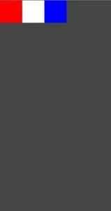
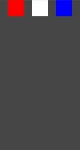
Our demo application will have a parent container with three boxes:
- red box
- white box
- blue box
The parent and child container is a View Component.
import React from 'react';
import { View, StyleSheet } from 'react-native';
const FlexboxExample = () => {
return (
<View style={styles.container}>
<View style={styles.redBox} />
<View style={styles.whiteBox} />
<View style={styles.blueBox} />
</View>
)
}
export default FlexboxExample
const styles = StyleSheet.create({
container: {
backgroundColor: '#454545',
},
redBox: {
width: 80,
height: 80,
backgroundColor: 'red',
},
whiteBox: {
width: 80,
height: 80,
backgroundColor: 'white',
},
blueBox: {
width: 80,
height: 80,
backgroundColor: 'blue',
},
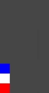
});Output:

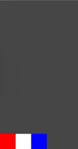
React Native Flex
After adding the property is flex: 1, the space is split into a single group; thus, our parent container will display on the entire screen.
container: {
  		backgroundColor: '#454545',
   		flex: 1
  	},
Output:

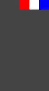
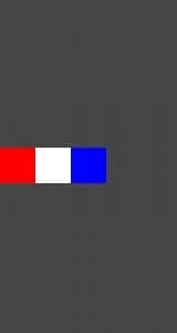
React Native Flex Direction
The flexDirection property in React Native’s Flexbox layout system determines the primary axis along which flex items are laid out within a flex container.
- row: This is the default value. Flex items are laid out along the horizontal axis, starting from the left side of the container to the right side.
container: {
 	   	backgroundColor: '#454545',
  	 	flex: 1,
  	 	flexDirection: 'row'
 	},
Output:
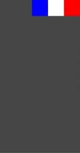
- row-reverse: Flex items are laid out along the horizontal axis, but in reverse order, starting from the right side of the container to the left side.
container: {
                backgroundColor: '#454545',
 		flex: 1,
  		flexDirection: 'row-reverse'
 	},
Output:
- column: It is the default value. Flex items are laid out along the vertical axis, starting from the top of the container to the bottom.
container: {
   	 	backgroundColor: '#454545',
    		flex: 1,
    		flexDirection: 'column'
  	},
Output:

- column-reverse: Flex items are laid out along the vertical axis, but in reverse order, starting from the bottom of the container to the top.
container: {
    		backgroundColor: '#454545',
    		flex: 1,
    		flexDirection: 'column-reverse'
     },
Output:

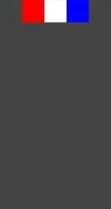
React Native Justify Content
Justify Content is used to align the child elements within the main axis of the parent container. You can set the elements horizontally and vertically by setting flexDirection as row and column.
- flex-start: It is the default value. Items are packed towards the start of the main axis.
container: {
  		  backgroundColor: '#454545',
  		  flex: 1,
  		  flexDirection: 'row',
  		  justifyContent: 'flex-start',
 	},
Output:

- flex-end: Items are packed towards the end of the main axis.
container: {
  		  backgroundColor: '#454545',
  		  flex: 1,
  		  flexDirection: 'row',
  		  justifyContent: 'flex-end',
 	},
Output:
- center: Items are centered along the main axis.
container: {
  		  backgroundColor: '#454545',
  		  flex: 1,
  		  flexDirection: 'row',
  		  justifyContent: 'center',
 	},
Output:
- space-between: Items are evenly distributed along the main axis, with the first item aligning to the start and the last item aligning to the end.
container: {
  		  backgroundColor: '#454545',
  		  flex: 1,
  		  flexDirection: 'row',
  		  justifyContent: 'space-between',
 	},
Output:
- space-around: Items are evenly distributed along the main axis with equal space around them. This means there is space before the first item and after the last item, and the space between each pair of adjacent items is equal.
container: {
  	         backgroundColor: '#454545',
  	         flex: 1,
  	         flexDirection: 'row',
  	         justifyContent: 'space-around',
 	 },
Output:

- space-evenly: Items are evenly distributed along the main axis with equal space around them, including before the first item and after the last item.
container: {
  		backgroundColor: '#454545',
  		flex: 1,
  		flexDirection: 'row',
  		justifyContent: 'space-evenly',
 	},
Output:
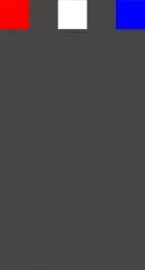
React Native Align Items
AlignItems is used to align the child with the cross axis of its parent container. Similar to justifyContent that aligns with the main axis, this property will align the children with the cross axis.
- flex-start: This is the default value. Items are aligned towards the start of the cross axis.
container: {
    		backgroundColor: '#454545',
  		flex: 1,
  		flexDirection: 'row',
    		justifyContent: 'flex-start',
   		 alignItems: 'flex-start',
 	},
Output:

- flex-end: Items are aligned towards the end of the cross axis.
container: {
    		backgroundColor: '#454545',
    		flex: 1,
    		flexDirection: 'row',
    		justifyContent: 'flex-start',
   		alignItems: 'flex-end',
  	},
Output:
- center: Items are centered along the cross axis.
 container: {
   		backgroundColor: '#454545',
   		flex: 1,
    		flexDirection: 'row',
                justifyContent: 'flex-start'',
        	alignItems: 'center',
 	},
Output:

Conclusion:
By mastering Flexbox, you’ll gain the ability to create user-friendly and adaptable layouts for your React Native apps. With its intuitive approach and powerful features, Flexbox empowers you to build beautiful and responsive mobile experiences!
Hire React Native Developer to help you build responsive web applications.
Happy Coding!