

200 OK, 301, 302, 307, 404, 410 and 503. For us non-coders, these digits are just mere numbers, but for coders and developers, these digits are more than just numbers. They are Error Codes.
The most common codes we come across are the error codes 404 and 503, of which the 503 error code is the most common. The reason why we view these codes once in our lifetime is that loading website pages with attractive images, appealing graphics and informative content is not enough to rank the website at the top and make it user-friendly. It is the proper and regular maintenance of the website pages that makes a website rank the highest.
The maintenance activity is a bit time-consuming sometimes because it depends on the reason and the severity of the issue, which has made the browser page break down. Or sometimes, the regular maintenance of the website might take some time due to technical issues.
Every individual wants instant answers to their instant questions. They bother about the answers only. Creative maintenance pages help the users get information about the 503 error page. In this blog, we have collected some interesting 503 error pages.
Maintenance Page – What’s That?
The websites are also loaded with tons of images, graphics and content, and extensive use of the website frequently forces it to load quickly, making it work beyond its actual capacity, resulting in the crashing of the site.
Along with the website crashing, another reason for website maintenance is regular website maintenance. Developers set an exact time for this process to avoid future website crashes.
Following this, the developers continuously work on upgrading the website and making it more user-friendly. As a result, during the testing process, some features work smoothly, and some don’t, and the website starts to work detrimentally. Hence, the developers need to perform website maintenance.
During the maintenance scenario, the developers can display creative graphics and informative content on the maintenance page instead of displaying the 503 error code, which is rarely understandable to your audience. The creative maintenance page will not frustrate the users, and they can get to know the reason why the page is facing issues.
If you are a Magento 2 user, our MageComp’s Magento 2 Maintenance Page Extension will facilitate your users by displaying a custom maintenance page whenever your website is under construction, upgrading its features, or a new product launch is coming soon. Our extension also allows the website owners to notify the users via email and make the page accessible.
Points to Consider While Creating a Creative Maintenance Page
1. Keep it Simple and Crystal Clear
As you have read previously, the developers are very well aware of the fact that their website users do not bother about the reason that has made the website undergo maintenance.
Still, displaying the reason behind the website maintenance will make the users feel valued and that the business feels in keeping its customers updated and informed about every single activity.
2. Find Ways to Keep the Visitors Engaged
The developers cannot control users’ activity after they come across the under-maintenance page. To prevent the users from leaving the website disappointed, the developers can provide them an option for a call to action, like surfing through their social media accounts until the website resumes its functionality. The website will gain social media traffic and increase brand visibility and customer loyalty.
3. When Will the Website Resume?
Just like informing the users about the reason for website maintenance, informing them about the resuming time will help them a lot, as they will not need to waste their time visiting the page every now and then and getting disappointed.
Suppose the page does not provide the users with accurate resuming time. In that case, it will give a bad impression of the website, and the business might lose its customers, resulting in decreased in-store revenue.
Best Creative Maintenance Page Examples
A. Simplicity at its Best
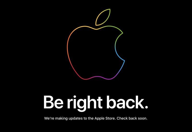
1. Apple
Apple does not need any kind of introduction. The most popular electronic device manufacturing company believes in simplicity.
The Apple website always coincidently or intentionally, only Apple knows, undergoes maintenance whenever a new product is to be launched.
Many users believe that the reason Apple’s website goes under maintenance so that they can upgrade their website so that it can handle the rush site and experience post-product launching.
(Source: https://www.apple.com/)
While for some users, Apple does this intentionally so that it can create an interest in its products using some creative and striking methods.
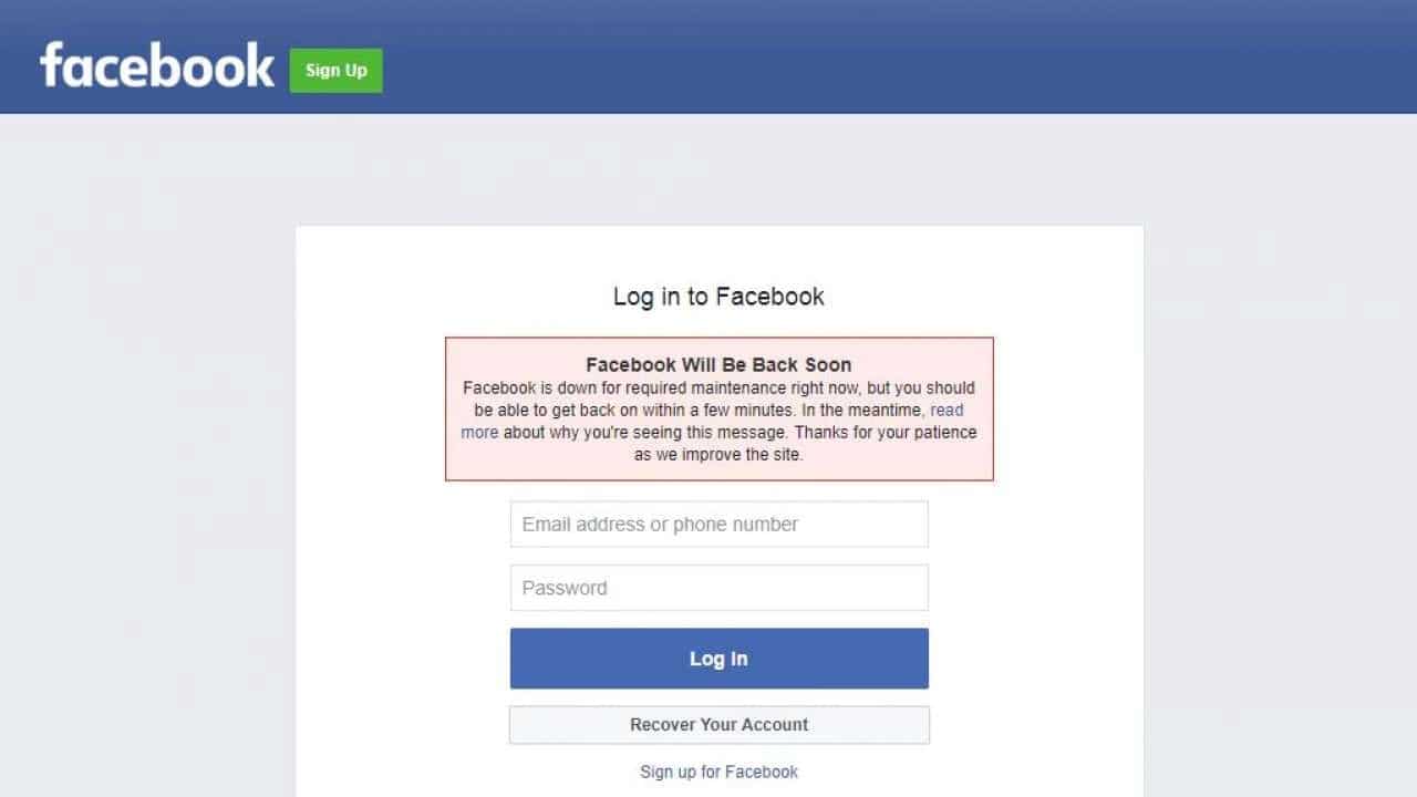
2. Facebook
Facebook, too, follows the steps to simplicity.
(Source: https://www.facebook.com/)
In the above-shown image, you can see that Facebook has its default logging-in page along with a simple display of information regarding website maintenance.
In the same message, if you read it carefully, they have also mentioned a “call to action,” directing the users to know more about the reasons that might be or can be the reason for leading Facebook to its maintenance.
Providing a “call to action” can keep your users engaged with the website for longer, and the users can gain some knowledge for similar future cases.
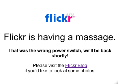
3. Flickr
Following the big companies, we have Flickr.
(Source: https://www.flickr.com/)
Whenever Flickr is down for maintenance, a message like “Flickr is having a massage. That was the wrong power switch, we’ll be back shortly!”
Minimal and simple information is displayed on their maintenance page, and just like the Facebook maintenance page, a call to action button is provided by Flickr for its users to visit their blog section if they would like to check out some new photos.
Users enjoy viewing images, no matter whether they are new or old. Photographs have their own story, which will never fail to keep the users engaged.
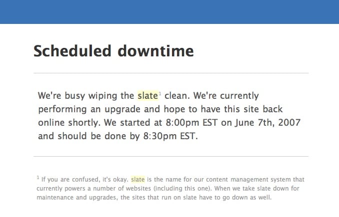
4. Slate
Slate is not an actual slate; it is an online platform. It was formed to encourage undergraduates to strengthen communication with school counselors, admission offices, and community-based organizations, along with helping the students with their college search and admission application process.
(Source: https://www.slate.com/)
The Slate shows accurate information about the reason behind website maintenance and the exact resuming time. In addition, if you pay notice, the message in small fonts says that the slate powers also, and if their site is down, other sites will be down too.
B. A Touch of Creativity
1. GitHub
GitHub is like heaven for coders and developers, as it is a code-sharing platform. GitHub is like a programmer’s social-networking site.
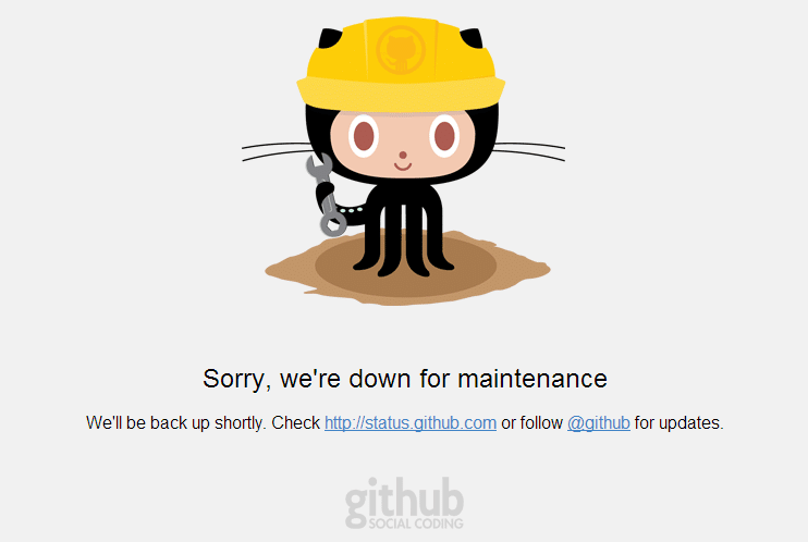
(Source: https://www.github.com/)
Whenever GitHub is under maintenance, a message like “Sorry, we’re down for maintenance” is displayed on the screen. The message is very simple and minimal, but the graphics of an octopus used in the creative maintenance page does not make the page look boring.
With the touch of little graphics, GitHub has also provided two call-to-action buttons to keep the visitors updated with their latest updates.
2. Google Wave
Though Google Wave has been discontinued for a long time, it was developed by the same masterminds that developed Google Maps.
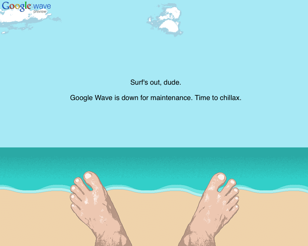
(Source: Google Wave)
The concept of Google Wave for Google was to describe the email technology if it was invented today, i.e., in the world of online forums, wikis and instant messaging technology.
The Google Wave’s maintenance page did not have much content or even any call-to-action buttons. But the graphics used by Google Wave made its maintenance page look creative.
3. iStockphoto
iStockphoto is a very well-known royalty-free image provider.
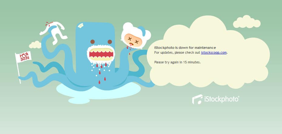
(Source: https://www.istockphoto.com/)
iStockphoto’s maintenance page shows a message like this, “iStockphoto is down for maintenance. For updates, please check out istockphoto.com. Please try again in 15 minutes.”
In this message content, iStockphoto has provided the down-for-maintenance information and the call-to-action button on their website so that users can surf some similar products until the website page resumes. Along with this, the iStockphoto has also provided information on the approx time duration within which the site may resume, and users can visit again.
Since the website provides no exact countdown or time, users might try to access the page before 15 mins and leave the page disappointedly. To prevent disappointment, iStockphoto can choose the option of displaying a countdown.
C. Increase Brand Visibility
1. Reddit
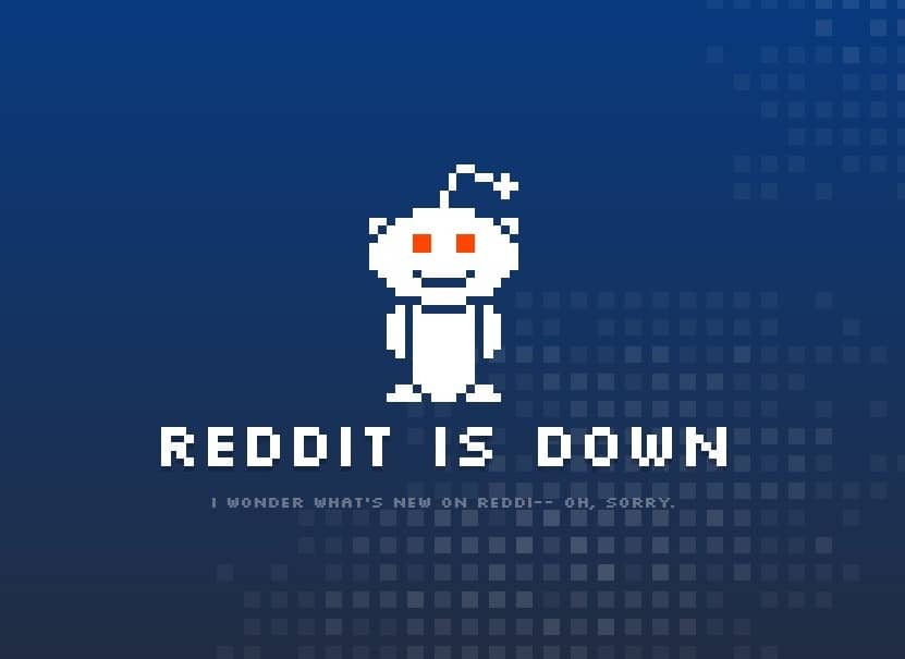
(Source: https://www.reddit.com/)
Reddit is a social news forum and website where site members vote to curate and promote content. Reddit is derived from a play on words called “I read it.” Using your own company logo increases its brand awareness and visibility.
2. Sound Cloud
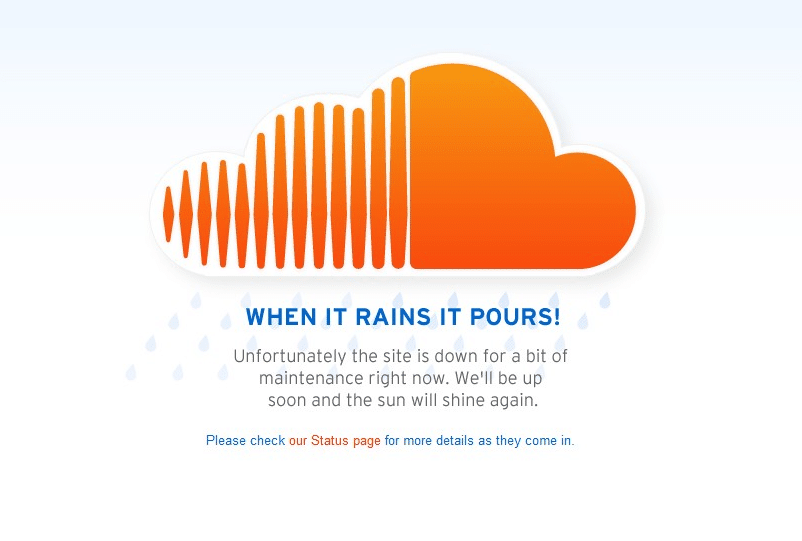 (Source: https://www.soundcloud.com/)
Following Reddit, Sound Cloud uses the same strategy of displaying its own company logo. Sound Cloud is an online music platform that allows its users to promote, upload and share audio.
3. The Beaverton
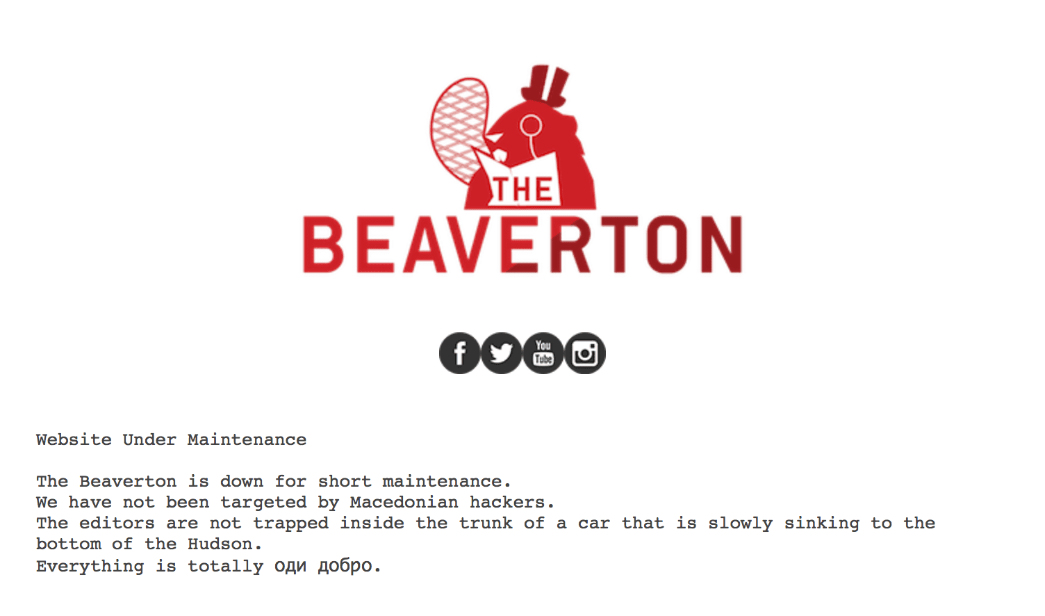
(Source: https://www.thebeaverton.com/)
The Beaverton is a Canadian publication that features stories, editorials, news, vox populi (voice of the people) and other updates like university reviews. The Beaverton also uses its company logo to make it look attractive and creative.
4. YouTube
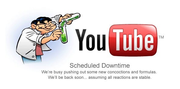
(Source: https://www.youtube.com/)
Youtube, too does not need any introduction. Everyone is aware of YouTube. YouTube also uses its logo on the creative maintenance page along with some different graphics to increase its attractiveness.
The usage of the YouTube logo remains the same, just the graphics change from time to time.
5. Product Hunt
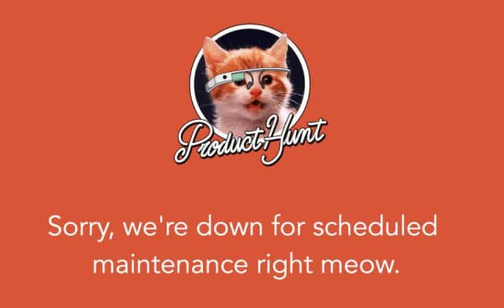
(Source: https://www.producthunt.com/)
Product Hunt is a product-sharing platform whose maintenance page says, “Sorry, we’re down for scheduled maintenance right meow.” Though the website maintenance may annoy users, but the little cat’s image will surely not.
D. Creativity at Its Best
1. Atlassian
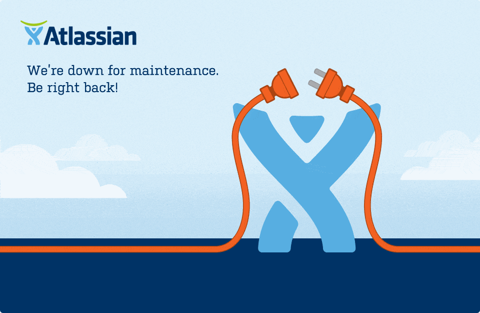
(Source: https://www.atlassian.com/)
Seeing this level of creativity for a maintenance page, every user can say that Atlassian took the definition of a creative maintenance page one step higher than others. Hardly will there be a website that has used a GIF for its creative maintenance page.
2. Twitter
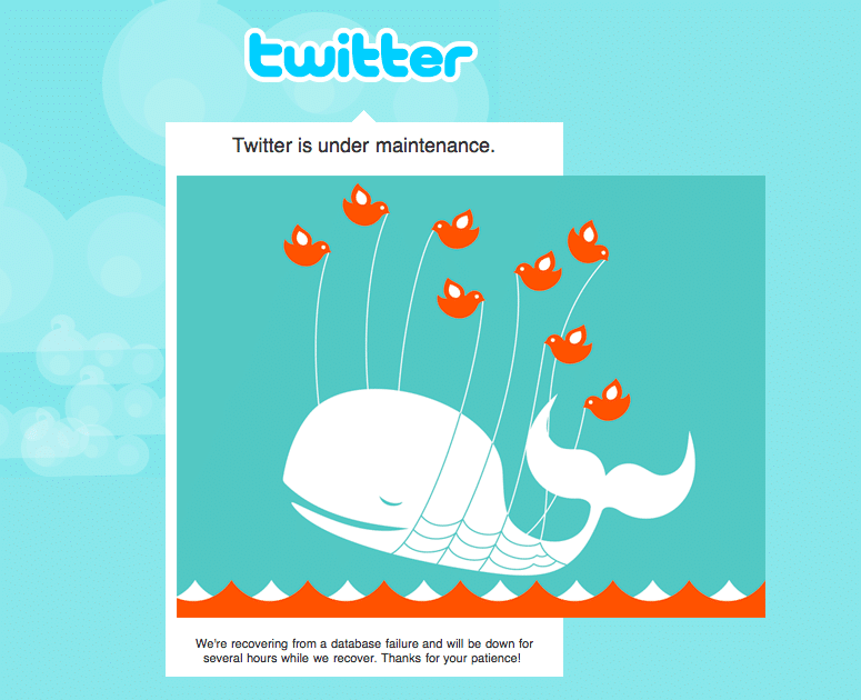
(Source: https://www.twitter.com/)
Twitter also took a very serious note of the importance of creativity, along with showcasing its Larry bird logo. Just like YouTube, Twitter also changed its graphics on the creative maintenance page occasionally.
3. Ning
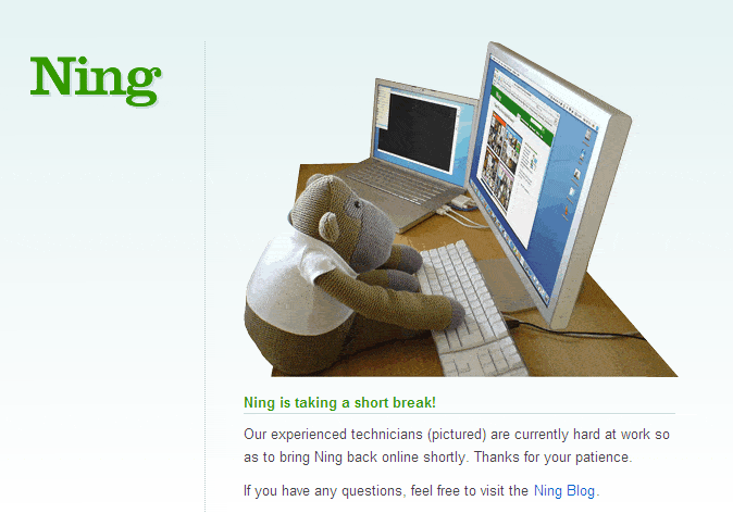
(Source: https://www.ning.com/)
Ning is a solution provider that provides tools and expertise for building and launching your own social network in an integrated social platform to engage your own community.
Ning uses a cute stuffed toy sitting in front of the computer as well as the maintenance information and a call-to-action button redirecting the users to Ning’s blog section.
4. MySpace
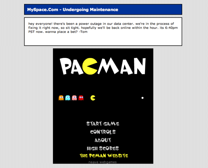
(Source: https://www.myspace.com/)
When MySpace first planted its roots, it was used by musicians and bands for sharing their concert dates and songs. But as time flew, this platform evolved and became more complicated as it provided users with a way to communicate, create webpages, and share their photos, diaries, movies and music.
When MySpace is under scheduled maintenance, they provide the user with a retro game named PacMan, and as we know, games are hard to resist. By providing the users with an amazing, engaging choice.
5. HootSuite
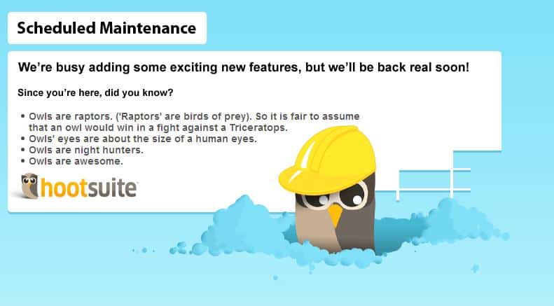
(Source: https://www.hootsuite.com/)
Though owls are a bit scary, but they possess their own cuteness. In this maintenance page layout, HootSuite has used a graphic of a cute little owl to describe the maintenance information and a call-to-action redirecting to their Twitter handle.
HootSuite 2009 expanded its creative boundaries, and to impress the users, it used the tactic of showcasing some Owl facts on the maintenance page. Don’t just leave disappointed. Gain some knowledge too.
E. Creativity by Using Real-Life Figures
1. Flickr
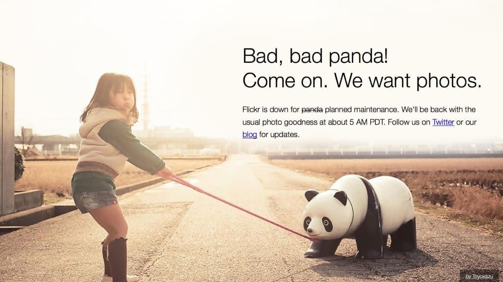
(Source: https://www.flickr.com/)
Once again, we have Flickr, which also keeps changing its creative maintenance page layout. In this layout, we can see a girl struggling to pull the panda as it is being a bad panda.
Apart from the image, in the content section, we can see Flickr has provided the maintenance information in a very funny and creative way, together with the resuming time and the redirecting link to their blog section as their call-to-action button.
2. iStockPhoto Jay
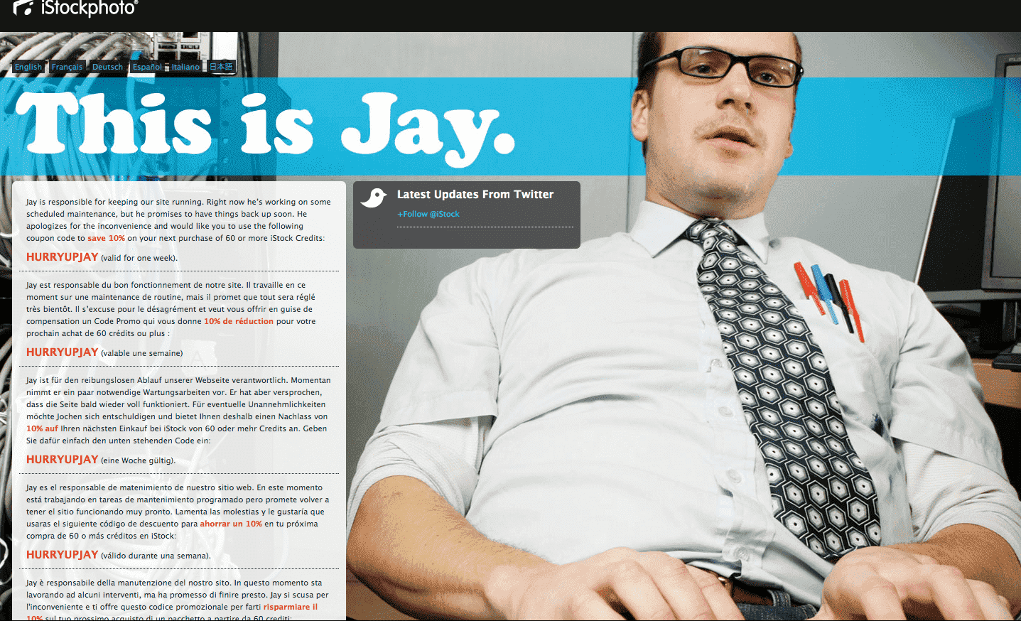
(Source: https://www.istockphoto.com/)
You might be surprised and impressed as well because Jay offers coupon codes and 10% discount codes during site maintenance.
3. LinkedIn
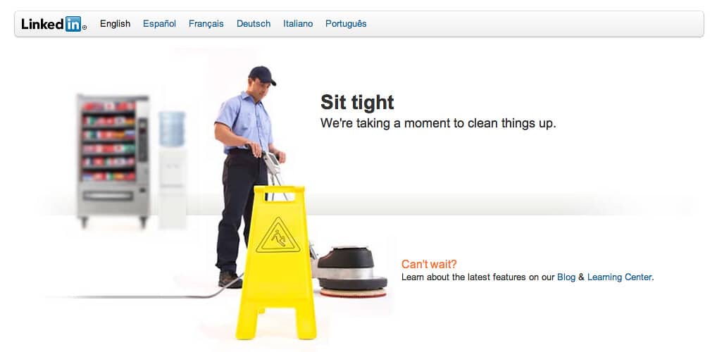
(Source: https://www.linkedin.com/)
On LinkedIn’s maintenance page, we can see a man cleaning the floor. And LinkedIn has also provided call-to-action buttons of their Blog section and Learning Center so that customers can choose any of them to explore more of LinkedIn.
4. Mixx

(Source: https://www.mixx.com/)
Who doesn’t love babies while they are napping? Mixx used the same concept, which was once a social media site. Their maintenance page features stories that are still accessible to visitors.
5. Nykaa

(Source: https://www.nykaa.com/)
Nykaa is one of the most popular beauty brands with millions of users. Being a beauty brand, when Nykaa goes under maintenance, it shows a message like, “We are at the spa for a Quick Beauty Upgrade. We Will Be Back Soon.” As spas have always been a break from the stressful life.
Ending Note
Last but not least. Your website needs to be very creative in getting more traffic and revenue, even if it is under maintenance mode, because creativity will keep people engaged with your website.
Instead of showcasing error codes that make no sense to the users, offering them creativity will do no harm to your website as well as the user.