Every online business has one ultimate objective: To convert their web visitors into paying customers.
To that end, providing customers with an organized and efficient online shopping experience is the key to success.
However, it’s not as easy as everyone expects it to be.
For one thing, you’re not exactly sure what’s causing your conversion rates to go up or down — you just know there are a hundred factors that affect it.
What’s more, no matter which seemingly profitable business ideas you’re thinking of running, if your website isn’t optimized for conversion, you’ll never be able to influence your web visitors to take action on your offers.
The challenges are endless.
To help you get more online sales, allow me to share with you seven elements that you can incorporate into your website so you’ll have better conversion rates.
1. Use Simple and Clear Navigation Path
Navigation menus placed on your landing pages can seem helpful. But the truth is, having them around your landing pages can hurt your conversion rates, too.
While improving navigation throughout your website is vital to converting visitors into paying customers, you’d need a navigation path clear enough to make sure your customers find their way to the pages that they’re looking for.
When creating your site’s navigation structure, it’s crucial for you to remember these two important aspects:
Instant gratification. Shorten the number of clicks that your customers need to make to find what they’re looking for.
Simplicity. Your navigation should be intuitive. Make it easy (and simple) for your web visitors to find the products they’re looking for.
Limiting the number of tiers in your navigation bars can help simplify things for everybody.
PrintGlobe’s latest study showed that conversion rates rose when the first level of navigation was given strong emphasis.
By creating a carousel navigation option and adding it with a grid view, PrintGlobe enabled customers to select a product category they’re interested in with ease.
The system made it easier for PrintGlobe’s customers to see their desired results in the page’s body and this significantly raised conversion rates by 18.5%.
In summary:
An easy-to-understand website navigation is crucial for large e-commerce companies that sell a variety of products.
The key is to lessen the number of navigation tiers that your website uses.
2. Mind-blowing Homepage
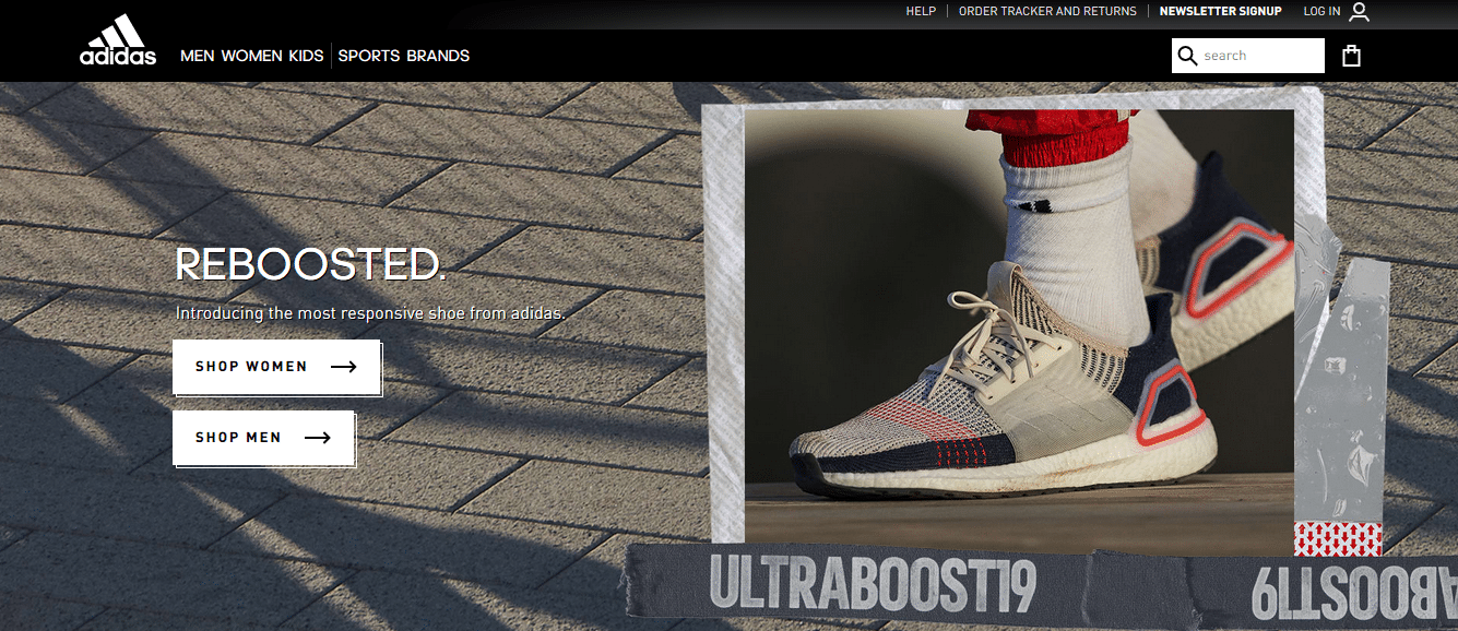
Adding an extra oomph and a bit of pizazz on your homepage may be what it needs to grab your customers’ attention and encourage them to buy from your website.
Adidas’ homepage immediately shows you its unique selling point: A brand that focuses on a flexible urban sports style.
You only need to briefly show a clear USP of your products; strong points which should reflect your brand’s personality, all while making sure your value proposition is direct and visible.
3. Clinch with Convincing Material
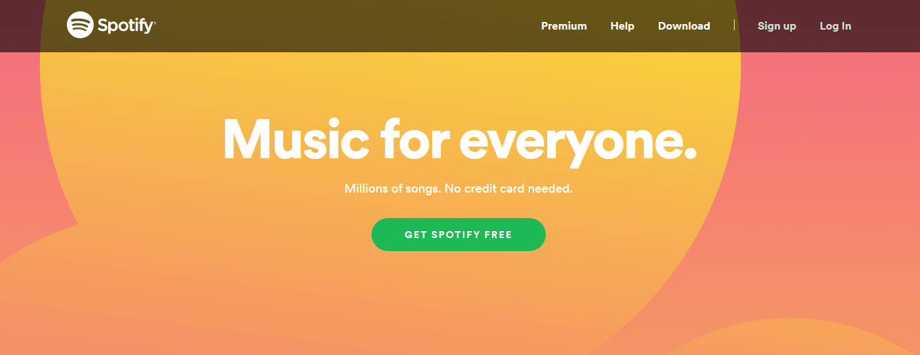
Your homepage should be optimized to call out a request for action to your customers to purchase your product.
The screenshot above shows how Spotify effectively advertises to its site visitors through persuasive messages and why it’s a great idea to download their app.
Remember that your marketing campaign shouldn’t just mention the services you offer and its features, but it should also include a compelling copy. One that resonates with your audience. One that compels them to make a purchase.
4. Negative Space guides the audience through the visual journey
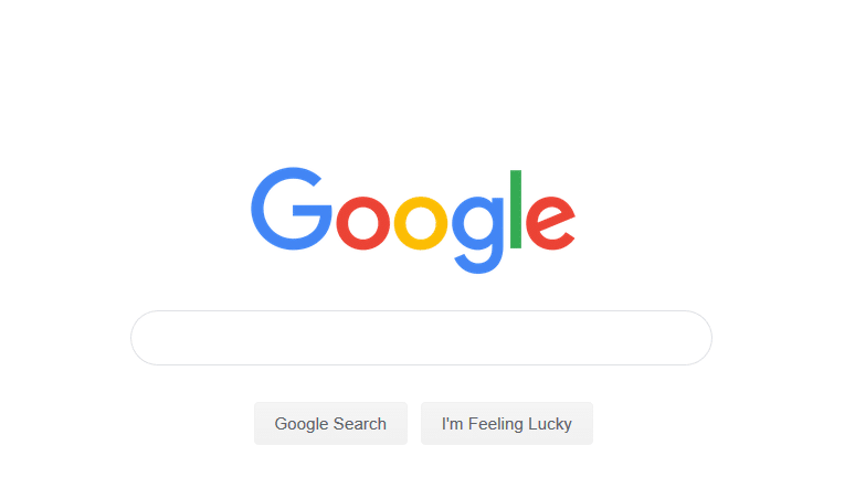
Typically, when you see an empty space, you’d want to fill it up. A bare homepage would not attract any visits, after all.
But negative spaces can be effectively utilized to boost online sales, and one big name that uses such a marketing strategy would instantly come to mind.
Google plays around with simplicity and clarity by employing the use of negative space to give a clear sense of how you’re supposed to interact with it: You’re there to use its search engine.
The effective use of negative space, along with many other reasons, is why the Google homepage is undoubtedly the most iconic landing page our digital age has had.
The use of negative space in web design is essential for the reason that anyone viewing the landing page can quickly spot the more prominent elements of the page.
Including negative space enables unique design pieces you’ve integrated into your homepage to stand out and stick inside your audience’s heads.
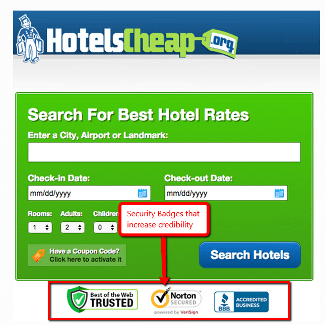
5. Build Client Trust With Security Trust Seals
Cybersecurity is a vital factor that consumers consider before parting with their hard-earned money.
With this, you will notice big e-commerce websites display their security accreditations like security certificates, awards, etc. on their homepages.
Building client trust online sets credible e-commerce service providers apart from the rest of the pack.
These security credentials should be strategically placed in a corner which should be visible the moment a visitor lands on your home page.
6. Landing Page Call-to-Action
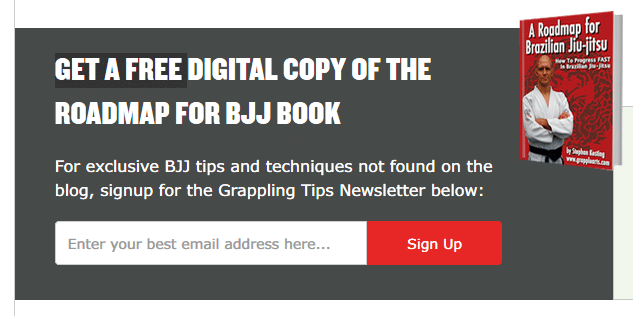
Landing pages are built for a purpose. Whether to generate leads through a free download or to sell a product, landing pages are designed to fulfill a single conversion goal.
Your conversion goal can be presented to your site visitor in all kinds of form that would transform into a Call-To-Action (CTA).
An effective CTA moves your traffic to do precisely what your landing page was made for. With it, you can attract customers to linger and know more about how great your products are.
However, if your landing page has a lame CTA, it’s never going to reach any of the conversion goals you set.
It’s human nature to react to the most minuscule physical and emotional cues, whether we’re conscious of it or not.
Think about how you judge a person you’ve just met, and right there and then decide whether you’d be great partners or not; a website visitor and the CTA on your landing page are exactly like that.
When designing your CTA, it’s essential to take note of using eye directional cues such as utilizing arrows, color contrasts, and whitespace.
A CTA button that’s prominently shown on your landing page would make your ask visible enough to catch your site visitor’s attention.
Customer-centric copy by using second person pronouns like “you” is helpful, but terms like “buy now,” “click here” and “submit” should be avoided.
Don’t be afraid to get creative when presenting your CTA!
7. Social Proof, Testimonials, and Awards
It’s a given that every online shopper is on his/her guard from scams and is incredibly cautious of new e-commerce websites. It’s human instinct!
So unless you’re an established brand like Amazon or a physical shopping center like Wal-Mart, you’d need to get your customers to bring their walls down and earn their trust.
When visitors see that other people trust you, it gives them a sense of security. One best way to do this is by using social proof or testimonials.
Reviews and positive comments from satisfied customers or mentions in well-known publications will help your visitors feel that it’s safe to transact with you.
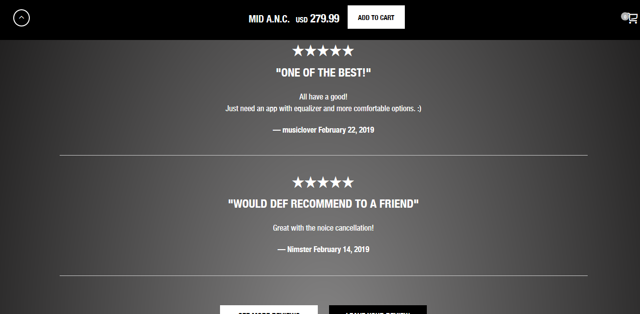
Popular music gadget brand Marshall effectively uses this strategy by showing all its buyer reviews on their page for every product.
What’s next?
In summary, your e-commerce website can’t compete with its competitors if you don’t know what factors would make your website soar or sink.
Arming yourself with the right knowledge and tweaking the right parts of your website will ensure your online sales. Who knows? Maybe you’d even dominate the e-biz world soon enough!
What do you think makes a great website for dropshippers like you? We’d love to hear your thoughts in the comments.


