Hello React Native Friends,
React Native brings you many components that can handle touch interactions, such as TouchableOpacity, TouchableHighlight, and TouchableWithoutFeedback. Each of these components has its own use case, and recently the Pressable component was introduced so that developers now have a more flexible and efficient way for handling press events.
In this blog post, I am going to discuss how Pressable component can make your application more responsive with the help of the touch feedback for the user.
What is Pressable?
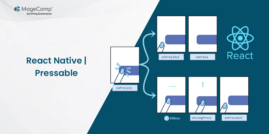
As a building block in React Native, it’s pressable where developers can detect touch interactions from a wide range of occurrences. Standard actions such as single presses, long presses, and so forth are used in it, and even more, delicate choices like press-in and press-out events.
Pressable, as a superior choice for creating interactive and responsive user interfaces in modern React Native apps, provides more enhanced control and flexibility over touch feedback and gesture recognition. Its versatility allows it to take place in any number of use cases to give a rich user experience that is easily adapted to the interactions of users.
<Pressable onPress={onPressFunction}>
  <Text>I'm pressable!</Text>
</Pressable>
Props of Pressable
Pressable comes with a variety of props that allow you to customize its behavior:
- onPress: Function to handle the press event.
- onLongPress: Function to handle the long press event.
- onPressIn: Function to handle the press-in event.
- onPressOut: Function to handle the press-out event.
- disabled: Boolean to disable the Pressable.
- hitSlop: Object or number to increase the pressable area.
- style: Style object or function to apply styles based on the press state.
- android_ripple: Object to configure ripple effect on Android.
Example:
import React, {useState} from 'react';
import {Pressable, StyleSheet, Text, View} from 'react-native';

const App = () => {
  const [timesPressed, setTimesPressed] = useState(0);

  let textLog = '';
  if (timesPressed > 1) {
    textLog = timesPressed + 'x onPress';
  } else if (timesPressed > 0) {
    textLog = 'onPress';
  }

  return (
    <View style={styles.container}>
     <Pressable
        onPress={() => Alert.alert('Button Pressed')}
        onLongPress={() => Alert.alert('Button Long Pressed')}
        onPressIn={() => console.log('Press In')}
        onPressOut={() => console.log('Press Out')}
        style={({ pressed }) => [
          {
            backgroundColor: pressed ? 'rgb(210, 230, 255)' : 'white'
          },
          styles.button
        ]}
        hitSlop={{ top: 10, bottom: 10, left: 10, right: 10 }}
        android_ripple={{ color: 'blue', borderless: false }}
        disabled={false}
      >
        <Text style={styles.text}>Press Me</Text>
      </Pressable>

    </View>
  );
};

const styles = StyleSheet.create({
  container: {
    flex: 1,
    justifyContent: 'center',
  },
  text: {
    fontSize: 16,
  },
  wrapperCustom: {
    borderRadius: 8,
    padding: 6,
  },
  logBox: {
    padding: 20,
    margin: 10,
    borderWidth: StyleSheet.hairlineWidth,
    borderColor: '#f0f0f0',
    backgroundColor: '#f9f9f9',
  },
});

export default App;
Conclusion:
Pressable is a powerful and flexible component for handling touch interactions in React Native applications. It provides better control, performance, and customization options compared to its predecessors. By incorporating Pressable into your mobile app, you can enhance the user experience and ensure your app remains responsive and intuitive.
Whether you’re building a simple button or a complex gesture-based interface, Pressable is a valuable tool in your React Native toolkit. Hire a React Native Developer to give it a try in your next project and see the difference it makes!
Happy Coding!


