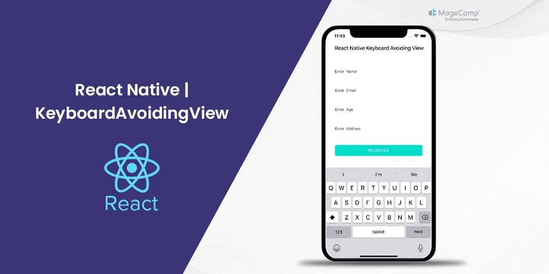
Have you ever been frustrated using a mobile app where the keyboard pops up and completely obscures the input field you’re trying to type in? It’s a common pain point for developers and users alike. Thankfully, React Native provides a handy component, KeyboardAvoidingView, to combat this issue.
What is KeyboardAvoidingView in React Native?
The KeyboardAvoidingView is a core component in React Native used to ensure that the view remains visible when the keyboard is displayed. It automatically adjusts its height, position, or padding when the keyboard is shown, ensuring that the input fields remain visible and accessible. This component is essential for forms or any screen that involves user input.
Attributes of React Native KeyboardAvoidingView:
In React Native, the KeyboardAvoidingView component accepts several attributes to customize its behavior and appearance. Let’s go through some of the commonly used attributes:
- behavior: This prop determines how the view should behave when the keyboard is displayed. It can be set to either ‘height’ or ‘padding’.
- padding: This will adjust the height of theKeyboardAvoidingView by adding padding to avoid the keyboard.
- height: This will adjust the height of the KeyboardAvoidingView by shifting its position upwards.
- enabled: The enabled attribute of KeyboardAvoidingView specifies whether the component should automatically adjust its position in response to the keyboard. By default, this attribute is set to true, enabling the automatic adjustment behavior. If you set it to false, it will disable this automatic adjustment behavior.
- keyboardVerticalOffset: This is the distance between the top of the user screen and the react native view, may be non-zero in some use cases. By default, this value is set to 0.
- contentContainerStyle: Style to be applied to the container wrapping the content. This allows you to apply custom styles to the container as needed.
Example of React Native KeyboardAvoidingView:
import React from 'react';
import {
View,  KeyboardAvoidingView,  TextInput, StyleSheet, Text, Platform,         TouchableWithoutFeedback, Button, Keyboard,
} from 'react-native';

const KeyboardAvoidingComponent = () => {
  return (
    <KeyboardAvoidingView
      behavior={Platform.OS === 'ios' ? 'padding' : 'height'}
      style={styles.container}>
      <TouchableWithoutFeedback onPress={Keyboard.dismiss}>
        <View style={styles.inner}>

          <TextInput placeholder="name" style={styles.textInput} />
              <TextInput placeholder="password" style={styles.textInput} />
          <View style={styles.btnContainer}>
            <Button title="Submit" onPress={() => null} />
          </View>
        </View>
      </TouchableWithoutFeedback>
    </KeyboardAvoidingView>
  );
};

const styles = StyleSheet.create({
  container: {
    flex: 1,
  },
  inner: {
    padding: 24,
    flex: 1,
    justifyContent: 'space-around',
  },
  textInput: {
    height: 40,
    padding:5,
    borderColor: '#000000',
    borderWidth: 1,
    marginBottom: 5,
  },
  btnContainer: {
    backgroundColor: 'white',
    marginTop: 12,
  },
});

export default KeyboardAvoidingComponent;
Conclusion:
KeyboardAvoidingView is a powerful tool in React Native that enhances user experience by preventing the keyboard from overlapping input fields. By understanding its properties and behaviors, you can create intuitive and accessible forms and input screens in your mobile applications. Experiment with different configurations to find what works best for your specific use case, and don’t forget to test on both iOS and Android devices for the best results.
Hire React Native Developers to build high-performing, user-friendly mobile applications.
Happy Coding!


