
Hello Shopify Friends,
With mobile commerce being on the rise, it is not optional but a necessity to make sure your Shopify store is running on mobile responsive devices.
Mobile commerce consumers use their smart phones for browsing and buying products online. Not adopting mobile-friendly strategies can mean unhappy users, abandoned sales and low ranking on search engine results. Shopify themes are designed with responsiveness in mind so your store will adapt tot he layout depending on the screen size it is used on.

Like all the other Shopify themes, all Shopify mobile themes are mobile friendly which makes them responsive to smartphone screens. Innovatively, your store will appear well on smartphones without creating extra configurations.
However, what if someone would like to extend the functionality and look of the mobile interface?
Steps to Set up Shopify Mobile View:
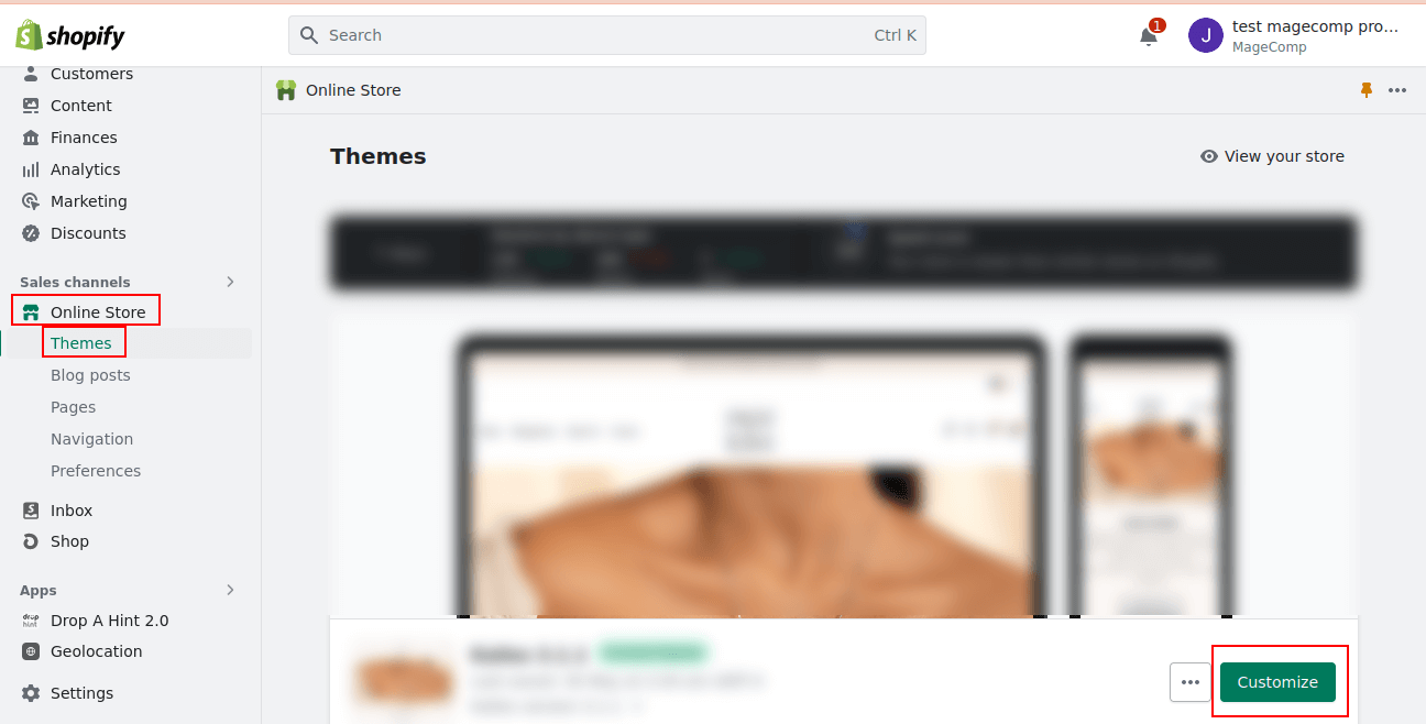
Step 1: Log in to your Shopify admin panel.
Step 2: Navigate to Online Store > Themes. In the Themes section, you’ll see your currently installed themes. Click on the Customize button for the theme you want to modify.
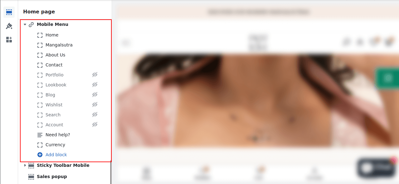
Step 3: Click on the Sections icon and navigate to the Mobile Menu option.
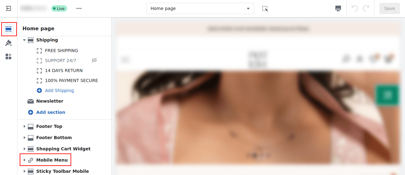
Step 4: Expand the Mobile Menu and unhide the options you want to display in the mobile menu.
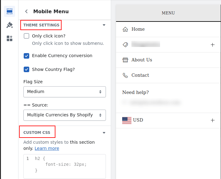
Step 5: Click on Mobile Menu, and you will be to apply various settings for

Final Words:
Making sure that your Shopify store is mobile-optimized can help you offer your mobile users an effective web browsing experience for the purposes of increased engagement and eventual conversions.
Customized theme or major content customization usually means that you’ll have to contact a developer or a Shopify Expert to help you manage the mobile view.
Happy Shopifying!
—————————————————————————————————————————————–
Frequently Asked Questions
(1) What is mobile view on Shopify?
Answer: Mobile view on Shopify literally means how the actual structure and look of your online store appears and how it reacts to smartphone and tablet applications. It makes sure that the design of your store looks good, works well, and is functional when viewed on, and sometimes accessed by, mobile devices.
(2) How can I enable mobile view on Shopify?
Answer: To enable mobile view on Shopify, follow these steps:
- Firstly, you need to get to your Shopify admin panel.
- In the left-hand side bar go to online store.
- As a starting point, select “Themes” in the drop down.
- The “Current theme” is located in the upper right corner of the window; to expand it, click at the “Customize” button.
- On the theme editor, it’s time to do some scouting and search for the mobile view. Again, depending on version this may be located under Mobile or Mobile Settings, but depending on your theme it could be slightly different.
- Adjust the options of mobile view to your liking. Everything can be aligned, fonts, colors and other aspects in a way to make sure that the design is also optimal for mobile browsing.
- Click save and your changes will be saved, your mobile view settings will then be enabled on your Shopify store.
(3) Can I preview the mobile view before applying it to my Shopify store?
Answer: Yes, there is a feature that allows one to preview the mobile view before launching it on the Shopify store. As with all open source applications, in the theme editor, the users should look for a preview that is specifically localized for mobile devices. Doing this enables you to get the screen of your store in different resolutions so that you can have the proper modifications before posting them.
(4) Are there any mobile-friendly themes available in Shopify?
Answer: Yes, Shopify currently provides plenty of mobile friendly themes which ensure the visitors will have the best experience on mobile platforms. All the same, choose a theme for your store that is labeled as mobile responsive or mobile-friendly. These themes include copyrighted styles and uses responsive methods of design that helps your store is perfectly displayed on any screen.
(5) What are some best practices for optimizing mobile view on Shopify?
Answer: Here are some best practices to optimize the mobile view on your Shopify store:
- Choose a responsive or mobile-friendly theme.
- Optimize your images for mobile by compressing them and reducing file sizes.
- Ensure that fonts are legible and appropriately sized for smaller screens.
- Use a streamlined and intuitive navigation menu for easy browsing.
- Make sure buttons and links are large enough and easy to tap with a finger.
- Simplify the checkout process for mobile users.
- Test your mobile view on different devices and screen sizes to ensure consistency and functionality.
(6) Can I customize the mobile view separately from the desktop view?
Answer: Yes, you can customize the mobile view separately from the desktop view in most Shopify themes. The theme editor typically provides options to modify specific elements and settings for each view. This allows you to create a tailored experience for mobile users while keeping the desktop version intact.
(7) What if I need further assistance with setting up mobile view on Shopify?
Answer: If you need additional help with setting up mobile view on Shopify, you can refer to Shopify’s official documentation and guides, which provide detailed step-by-step instructions. Additionally, you can reach out to Shopify’s support team for further assistance. They can provide guidance and help troubleshoot any issues you may encounter during the setup process.