In the world of digital marketing, the significance of a website cannot be overstated. A well-designed website is the cornerstone of a company’s online presence, capable of showcasing products, services, and core values. For businesses operating in the Business-to-Business (B2B) space, a website is not merely an online storefront but a crucial tool for demonstrating expertise, reliability, and credibility to potential clients.
The power of an effective website design cannot be underestimated, especially in the B2B realm, where the visual representation of your brand can significantly impact your business’s success. Not only does a well-crafted website grab attention, but it also communicates your brand’s identity, values, and most importantly, what you offer to potential clients. To give you some inspiration, here are seven amazing B2B website design examples from leading companies:
This blog post presents seven outstanding B2B website designs, exploring their strengths and unique features that set them apart in the competitive landscape.
What is a B2B Website?
A Business-to-Business (B2B) website is a digital platform designed specifically for companies that sell products or services to other businesses. Unlike Business-to-Consumer (B2C) websites, B2B websites cater to a different set of needs, focusing on providing detailed product information, showcasing expertise, building trust, and facilitating business transactions between businesses.
A Business-to-Business (B2B) website is a digital platform specifically designed for businesses that sell products or services to other businesses rather than individual consumers. These websites serve as a primary digital asset for B2B companies to present their offerings, communicate their value proposition, and facilitate interactions with potential clients.
B2B websites play a crucial role in the B2B sales process by serving as a central hub for potential clients to learn about a company’s offerings and make informed decisions. A well-designed and strategically crafted B2B website can be a powerful tool for driving leads, nurturing relationships, and ultimately closing deals in the business-to-business market.
7 Inspiring B2B Website Design Examples
Asana
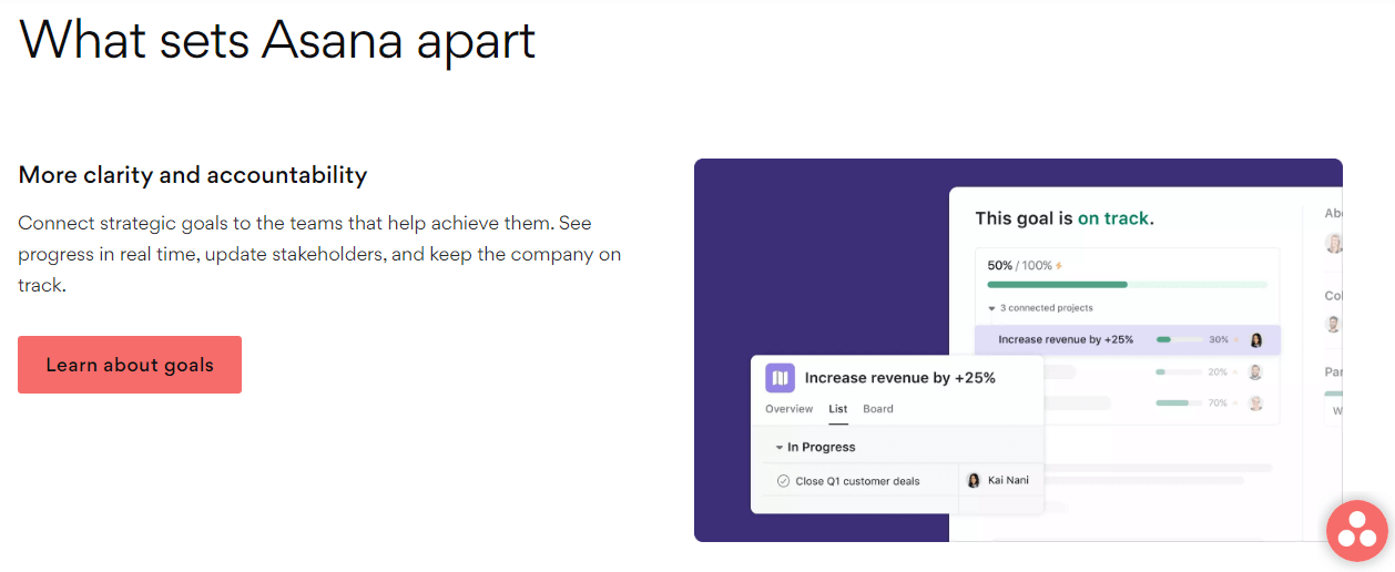
Asana is a popular project management software designed to help teams collaborate and manage their work effectively. Asana is a versatile and powerful tool that individuals and teams across various industries can use to improve productivity, collaboration, and project management.
What Makes It Great:
- Simple Yet Striking: Asana’s website is straightforward, yet visually appealing. The contrasting colors and clean lines guide users’ attention to the essential features.
- Concise Messaging: “Work better together” immediately conveys the platform’s core benefit, while the website showcases key features without overwhelming users.
Why It Inspires:
- User-Focused Design: The emphasis on user benefits and functionality speaks to businesses looking for efficient project management solutions.
- Clear Calls-to-Action (CTAs): The CTAs guide visitors towards trying the product or learning more, optimizing conversion rates.
Dropbox
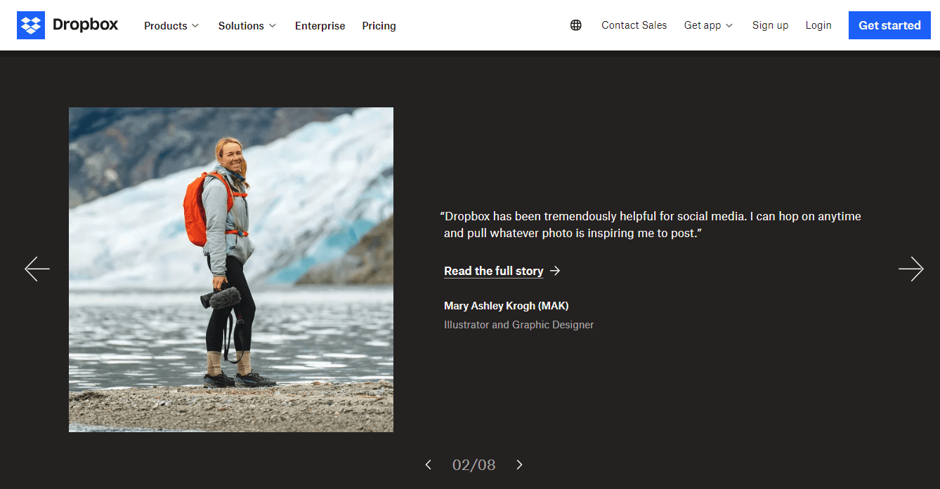
Dropbox is a popular cloud storage service that allows users to store and share files securely. Dropbox offers secure, convenient, and reliable cloud storage solutions for individuals, businesses, and teams alike.
What Makes It Great:
- Compelling Storytelling: Through real-life customer stories and testimonials, Dropbox’s website humanizes its brand and demonstrates practical applications of its solutions.
- Interactive Elements: The dynamic elements and interactive features engage visitors and make exploring the website an enjoyable experience.
Why It Inspires:
- Trust Building: By showcasing user success stories, Dropbox builds trust and credibility with potential clients.
- Seamless Navigation: The site’s user-friendly design ensures that visitors can easily find what they’re looking for, enhancing the overall user experience.
Hootsuite
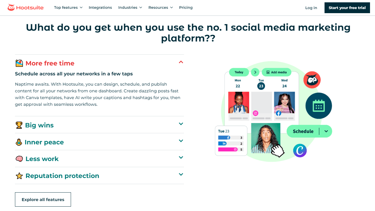
Hootsuite is a social media management platform that enables individuals and businesses to streamline their social media marketing efforts. It allows users to manage multiple social media accounts, schedule posts, track engagement, and analyze performance from a single dashboard.
What Makes It Great:
- Dynamic Design: Hootsuite’s website employs dynamic elements, like the video on the homepage, to capture attention and create an engaging user experience.
- Bold Typography: The use of bold typography and vibrant colors reflects the brand’s energetic personality and modern approach.
Why It Inspires:
- Visually Appealing: The site’s aesthetic appeal draws visitors in, effectively communicating Hootsuite’s values and positioning.
- Functional Design: Hootsuite’s website showcases its product’s features and capabilities in a clear, organized manner, making it easier for visitors to understand its value.
HubSpot
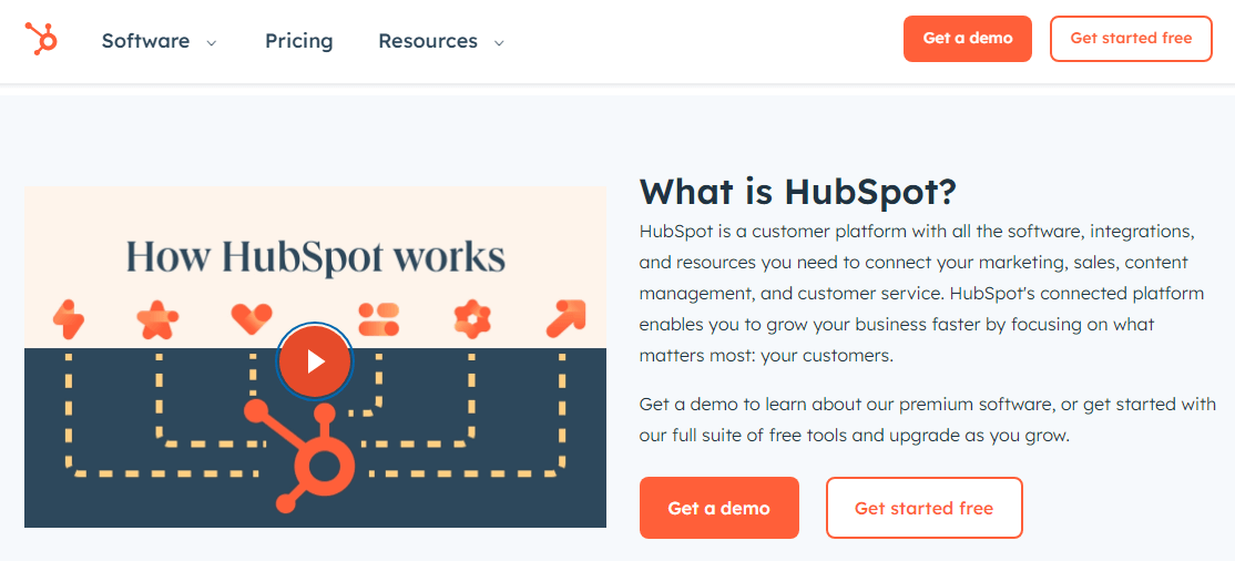
HubSpot is an all-in-one marketing, sales, and customer relationship management (CRM) platform designed to help businesses grow their online presence, attract leads, and engage with customers. It offers a suite of tools and features that streamline marketing and sales processes, including lead generation, email marketing, social media management, and more.
What Makes It Great:
- Striking Visuals: HubSpot’s website makes excellent use of high-quality images and a consistent color scheme to create a visually cohesive experience.
- Customer Stories: The inclusion of customer testimonials and case studies helps establish credibility and demonstrates real-world benefits.
Why It Inspires:
- Trustworthiness: The site’s design exudes professionalism, making HubSpot appear trustworthy and reliable to potential customers.
- Informative Content: The website effectively educates visitors about HubSpot’s offerings and how they can benefit from them.
Trello
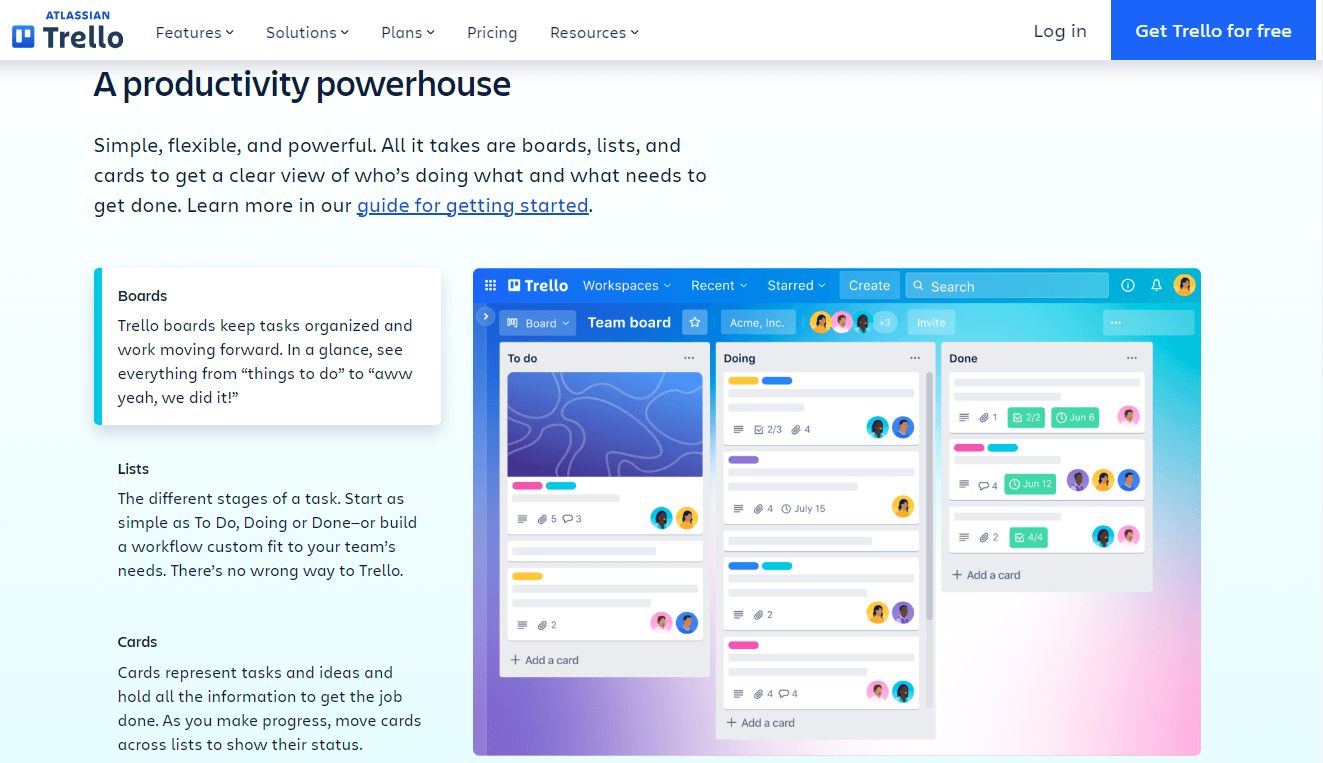
Trello is a project management tool that organizes your projects into boards. In one glance, Trello tells you what’s being worked on, who’s working on what, and where something is in process.
What Makes It Great:
- Whimsical Design: Trello’s website has a playful, animated design that mirrors its user-friendly platform.
- Clear Communication: The use of icons and graphics makes it easy for visitors to understand Trello’s features and benefits quickly.
Why It Inspires:
- Personality: The site’s design showcases Trello’s fun and approachable brand personality, making it memorable to visitors.
- Simplicity: The website’s straightforward layout makes it easy for visitors to navigate and understand Trello’s offerings.
MailChimp
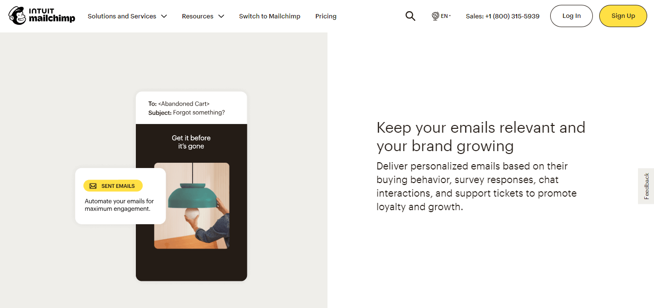
Mailchimp is an all-in-one marketing platform that helps small businesses manage and grow their mailing lists, create email campaigns, and track performance. Its simplicity, robust features, and extensive integrations make it a popular choice for businesses looking to improve their email marketing strategies.
What Makes It Great:
- Modern Aesthetic: Mailchimp’s website has a modern and clean design that reflects the brand’s personality.
- User-Friendly Interface: The website is easy to navigate, with a logical layout that guides users through the information they need.
Why It Inspires:
- Functional Design: Mailchimp’s website design is functional and user-friendly, providing a seamless experience for visitors.
- Memorable Branding: The website’s design reflects Mailchimp’s brand identity and values, creating a memorable user experience.
Blake Envelopes
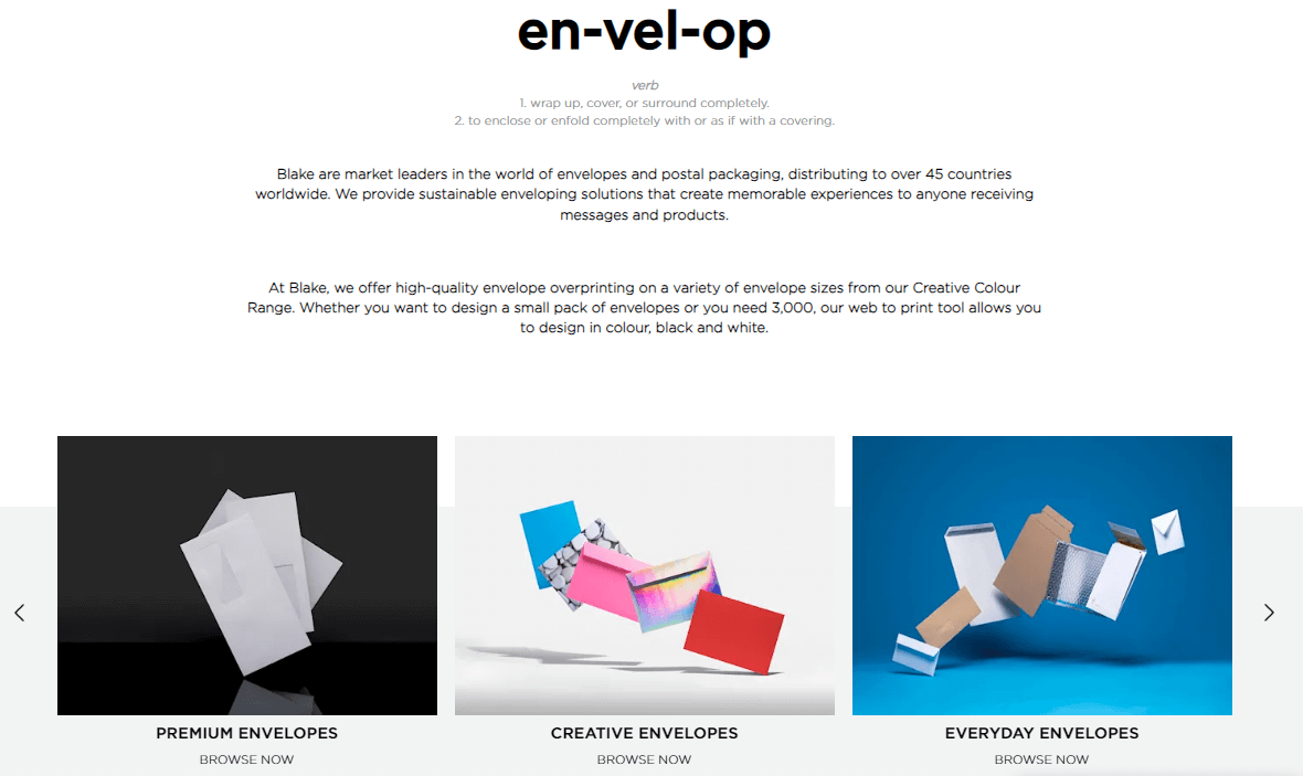
Blake Envelopes is a UK-based company specializing in the design and manufacture of high-quality envelopes for both personal and business use. They have been operating for over 30 years and have a reputation for producing envelopes of the highest quality.
What Makes It Great:
- Visual Impact: Blake Envelopes’ website immediately captures attention with a fullscreen video that showcases its products in action.
- Engaging Design: The use of bright colors and bold typography creates a lively, energetic feel that draws visitors in.
Why It Inspires:
- Memorable Branding: The site’s visual impact and engaging design make Blake Envelopes’ brand memorable to visitors.
- Functionality: The website effectively communicates the company’s product offerings and capabilities, making it easier for potential customers to understand its value.
Final Thoughts:
These seven B2B website design examples showcase a variety of approaches that businesses can take to create engaging, user-friendly online experiences. By focusing on simplicity, clear messaging, and visually striking design, these websites effectively communicate their brand’s value proposition and inspire confidence in potential customers. Whether you’re in the process of designing a new B2B website or looking to improve your existing one, these examples can provide valuable inspiration and guidance.
Also, check Best B2B Website Designs for eCommerce


