E-commerce refers to making your goods or service available over the internet. Your website must impress your audience if you want your business to sell more. Otherwise, you won’t get targeted traffic to increase your sales.
If you want to enhance your website to look professional, then you should consider hiring a web design firm. These firms employ graphic designers who can create logos, palettes, branding, and other content for your website. Want to know some more e-commerce design tips? Make sure to keep reading to learn more!
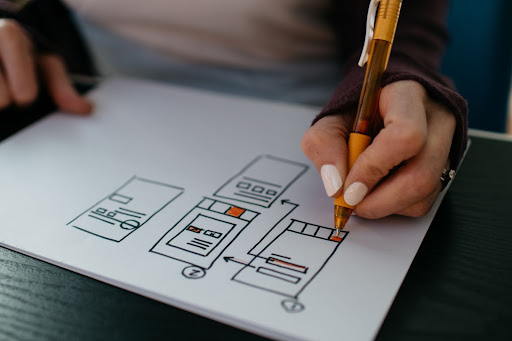
1. Keep Your Site Simple
Photo Credit: Unsplash.com
It can be too easy to cram your website with graphics and text without having website developing experts. When you do this, however, your visitors won’t be able to find what they want. In the end, they’ll probably spend only a minute clicking around on your site before they give up.
You also want to avoid clutter. Too many ads distract your site’s visitors and can even drive them away. Plus, you want to make sure the site makes it easy to find everything your visitors might want to see.
The best thing is you should consider your customer’s needs from the website. Everything should be easy to see, and it shouldn’t take more than two clicks to find important information. It would help if you had all of these aspects incorporated into your website:
- Fonts that are easy to read
- Skimmable text
- Consistent color palettes
- Navigation buttons and links
2. Use Strong Visuals
Next, you must use strong visuals on your website. Superior pictures quality lets your potential customers get a better look at your products. When designing a website, you want to “show, don’t tell.” Your product images should take center stage on your site.
Clear pictures show your customers exactly what they get with their orders. If you want to increase conversion even further, you should offer plenty of product shots at different angles. Most customers want 360 display and inspect the product before purchasing. You can help them by providing clear visuals- so take some time to take high-quality product photos!
3. Make Checkout an Easy Process
You want to make it very easy to find your checkout page. Otherwise, your customers might give up before making it there, even if they have a cart full of products! It also helps if your site is clear about the product’s price and shipping charges.
When shipping doesn’t appear until the end of the transaction, customers might be surprised by their cart’s final price, leading to them canceling the purchase. Your site should have all of the prices listed to avoid this.
Overall, your visitors should have an easy time figuring out how to reach their cart. Use graphics, links, and other techniques to guide them to the correct location.
4. Optimize Your Website for Mobile Devices
Photo Credit: Unsplash.com
Have you ever opened a new website on your cell phone, but it was too slow? You probably closed out of the site right away- you don’t want your visitors doing that to your site! For that reason, you should optimize your website for mobile devices.
You want to make sure the images, links, and text load correctly. That means they need to adjust to any size of screen automatically. As you design your site from a computer, make sure to open it on your phone from time to time. Doing this will help you determine what to change before it gets too complex to fix.
Your site also needs to be responsive, which is another reason to use a simple design scheme. After a few seconds of waiting for a page to load, most mobile users quit the site.
5. Learn to Use Color
When it comes to Website Designing, you must choose the correct colors. Specific colors make people feel a certain way, so you can use color to paint your products in a positive light. For example, have you noticed that most notification markers are red? Because red captures our attention. If you want to make a purchase button stand out on your page, then a shade of red is usually a good idea. Many marketing designers have tested this idea and noted that red shows more conversions.
You can use color in a variety of ways on your website. It may help to experiment with what you already have. Overall, it would be best if you had a consistent color scheme associated with your brand identity.
6. Add Social Proof
Social proof is significant when building an e-commerce website. You want to leave spaces for your customers to leave their reviews. Plus, you can add a rating system to your products.
When people see that others have bought something, they’ll feel more comfortable purchasing it for themselves. We can’t see the products in person with online shopping, so we seek out what others are saying about it.
If there’s no social proof that a product is good, potential customers won’t checkout. Also, encourage your old customers to leave pictures of their orders on your website. That way, new visitors to your site have something they trust to look at.
7. Add a FAQ Page
Adding a FAQ to your website helps customers to find answers to the most common questions. This page lets your customers know that you take their concerns seriously and want to help them shop with you. It also changes how visitors view your customer service for the better.
In short, you should have a FAQ on all of your websites!
What Makes an Effective E-Commerce Website?
Photo Credit: pexels.com
The best website designs are simple and easy to navigate. You want to avoid clutter and direct visitors to your goods. The best websites focus on the following:
- Positive user experiences
- Site layout
- Good visual design
- Mobile and PC adaptability
If you follow all of the website design tips listed above, you’re sure to have an easier time making your website. Visitors feel comfortable when they can easily find all of the information they need, making clear layouts one of your priorities.


Great Work!!!
Thank you for sharing information.
A nice piece by Gaurav Jain. The website design tips are really noteworthy. Honestly speaking, the web design ideas are not limited to specific numbers. Theoretically it can be possible but in practical the list is very long.
I really enjoyed this posting in which you share a valuable post. Thanks for sharing it. Keep it up.
This blog resolved all my queries I had in my mind. Really helpful and supportive subject matter written in all the points. Hard to find such kind of blogs as descriptive and accountable to your doubts.
these informative tips are really good to know about web designing. thank you fro such content.
Very interesting and thanks for sharing such a good blog. Your article is so convincing that I never stop myself from saying something about it. You’re doing a great job. Keep it up.
This article gives a clear idea for eCommerce, You’ve done a great job. Keep it up.
These tips are very beneficial and very best. I am very happy to know these tips. thank you .
Thank you for suggesting avoiding clutter and making everything you see easily when it comes to a web design. We have our own business, but the traffic on our website is not picking up speed. We want to make our site a higher quality. Though we could try to do this ourselves, we feel that it might be better to go with a professional website design service since they are not just getting their feet wet with web design.
Last time I hired developer he developed my business ecommerce site using cms call Shopify but I was not satisfied with his work or maybe the cms didn’t provide me what I wanted.
Do you have suggestion related best cms for small business ecommerce site?
Thanks
You can look for Woocommerce or Magento in that case,
great post
Using a strong visual in any website is essential, primarily in e-commerce. These are excellent tips you can use to build an e-commerce website.
Excellent post. Great resources! Styling your blog in a great way is the key to achieve success and you have made it the right way.
Thanks for sharing this. I agree! A well-designed website can help you form a good impression on your prospective customers. It can also help you nurture your leads and get more conversions.
Thank you for these great tips….!
wow we are developing Ecommerce and this blog very helpful
Wow, this tutorial was really helpful to me. I was trying to do this until I read this tutorial, but I wasn’t able to understand it. Now that I’ve read it, I understand.