Hello Shopify Friends,
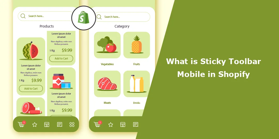
In this Shopify blog, I will explain Sticky Toolbar Mobile in Shopify and How to Set up a Mobile Sticky Bar in Shopify.
What is Sticky Navigation Bar?
A sticky toolbar, also known as a fixed or floating toolbar, is a user interface element that remains visible at the top or bottom of a webpage, even as the user scrolls through the content. It typically contains important navigation links or actions to which users may need quick access, such as a shopping cart, search bar, or account options. It helps enhance the user experience by keeping essential functionality readily available without requiring users to scroll back to the top or bottom of the page.
You can explore the following steps if you want to add a sticky toolbar to your Shopify store’s mobile version.
Steps for Mobile Sticky Bar in Shopify:
Step 1: Log in to your Shopify Admin Dashboard.
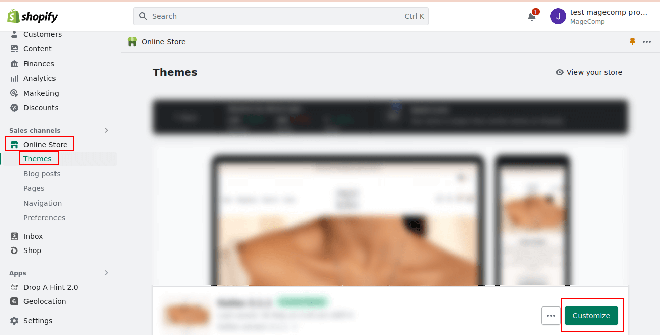
Step 2: From the left menu, navigate to Online Store > Themes. Click on Customize button for the theme you want to apply the sticky toolbar in Shopify.
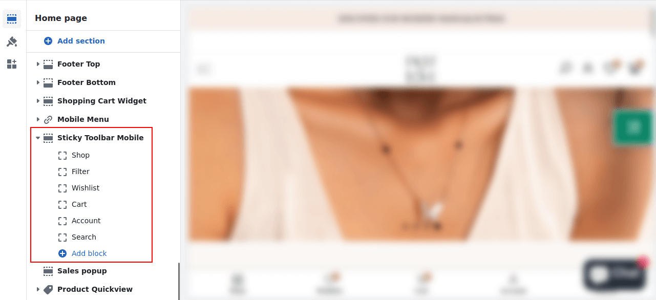
Step 3: Now choose the Sections icon and move to the Sticky Toolbar Mobile option.
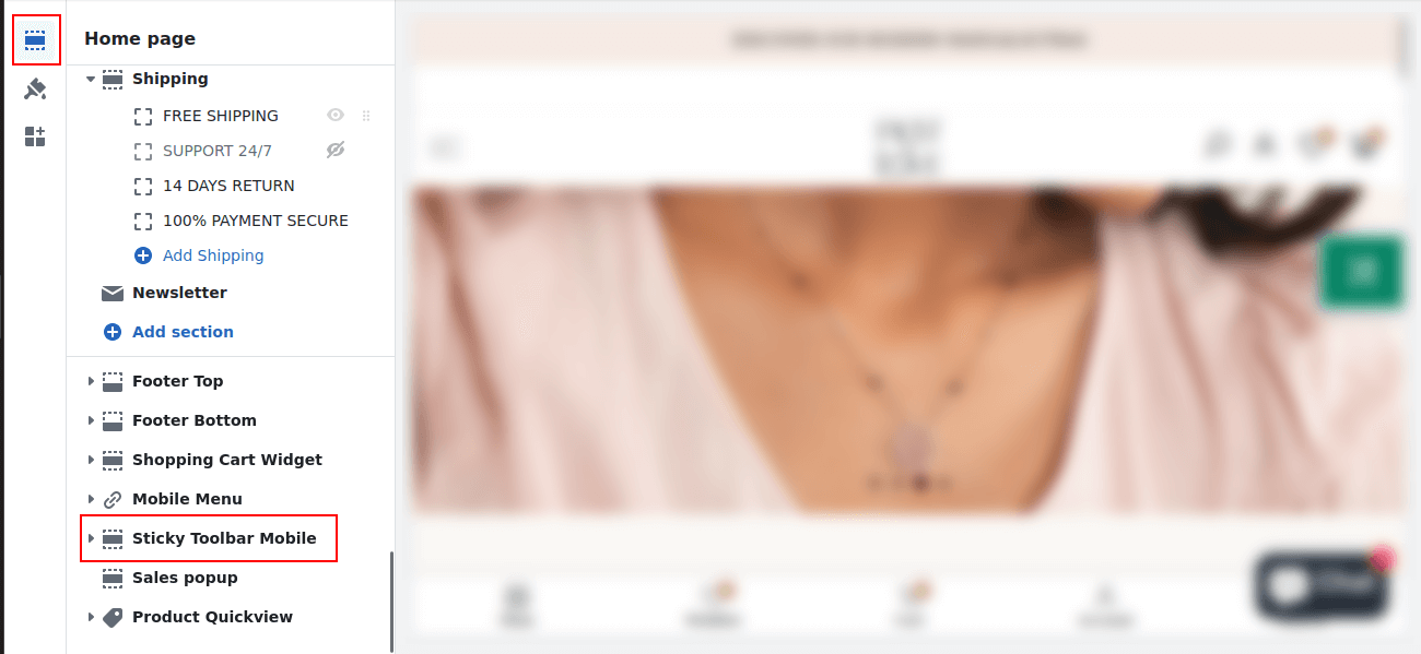
Step 4: Expand the Sticky Toolbar Mobile menu and select the option as per your requirement.
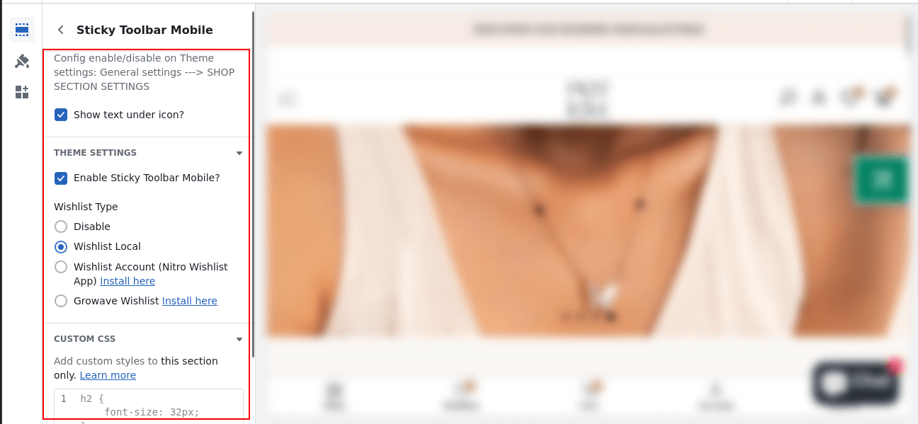
Step 5: Click the Sticky Toolbar Mobile menu and apply settings as per choice
Final Thoughts:
Hopefully, you will be able to apply Mobile Sticky Bar in Shopify. Consider hiring a Shopify developer to customize your store’s theme and add a sticky toolbar tailored to your specific requirements.
Stay connected with us for more Shopify solutions.
Happy Reading!
—————————————————————————————————————————————–
Frequently Asked Questions
(1) What is a sticky toolbar in the context of mobile websites?
Answer: A sticky toolbar could be defined as a navigation or menu bar that stays stuck to the top or bottom of the screen as you scroll through a mobile website. This guarantees that navigation elements that are critical to user experience, such as menus, search bars, or action buttons, are always within reach of users, anywhere on the page.
(2) How does a sticky toolbar benefit mobile users?
Answer: On mobile devices, a sticky toolbar makes the onboarding process a natural and convenient experience through providing simple and persistent access to a few most important functionalities. Users can move through different sections of a given website, search inside them, switch to account settings, and trigger any action without need to scroll back to the top of the page. In doing this it will save you time and effort and result in an easier more efficient browsing experience.
(3) How is a sticky toolbar implemented in Shopify?
Answer: Typically, to implement a sticky toolbar on the mobile website in Shopify, it is required to customize the theme’s code. Shopify offers a very flexible yet customizable platform; shops or developers can replace the theme templates with their own version as per their need and add specific code snippets (or scripts) that serve the purpose of a sticky toolbar. The sticky behavior and design elements may be created by using HTML, CSS, and JavaScript.
(4) Can a sticky toolbar be added to any Shopify theme?
Answer: Generally, yes. The vast majority of the Shopify themes come with options to add a sticky toolbar. However, if you’re using a theme, you’ll have varying levels of customization and ease of implementation. If you’ve chosen your theme already it’s worth checking the documentation or contacting the theme developers to find out whether the chosen theme is sticky-toolbar compatible or whether they may need some extra coding.
(5) What elements are typically included in a sticky toolbar for mobile websites?
Answer: There are different versions of a sticky toolbar with respect to the design and purpose of the website. However, a sticky toolbar share common elements, typically a logo or branding, a nav menu, search field, cart or basket summary, account log in or user profile options, and action button, like “Add to Cart” or “Buy Now.” The elements selected are usually chosen to give you fast access to some important features or pieces of information


