UX design is a relatively new field that is developing really fast. And it’s not a big surprise that not all UX experts are aware of the latest trends.
If you work in this field and want to know what trends to implement on your site, read this article. Here are a few actionable tips that may take your website to the next level.
Get rid of distractions
The attention span of a modern user is pretty short. And if your web page contains lots of distractions, the chances are that users will not find the necessary information within the first 2.6 seconds. He will leave your website and will never come back.
So before you add anything to your site, think about what is important for the users. Get rid of all CTA buttons, visuals, and wordy sentences – anything that may distract your visitors.
If you want to focus your users’ attention on your product, you may use the so-called “white space” or “negative space”. It’s a simple yet effective way to kill distractions and boost conversions.
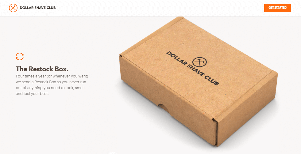
Present your product in the right way
In 2026, users experience information overload. They do not want to know about each and every feature your product has. They only want to know what specific benefits they can get from using your product.
To present your item in the best way, do the following:
- List three to seven the most important features of your product. If your product has dozens of features, add the “learn more” button and direct visitors to the related page.
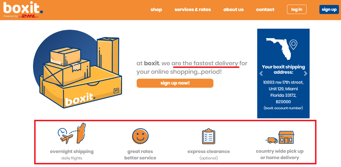
- Think like a user. Start describing your product from the words that your customers want to hear the most. For instance, if you provide delivery services, you should start a product description from the words “we are the fastest delivery”.
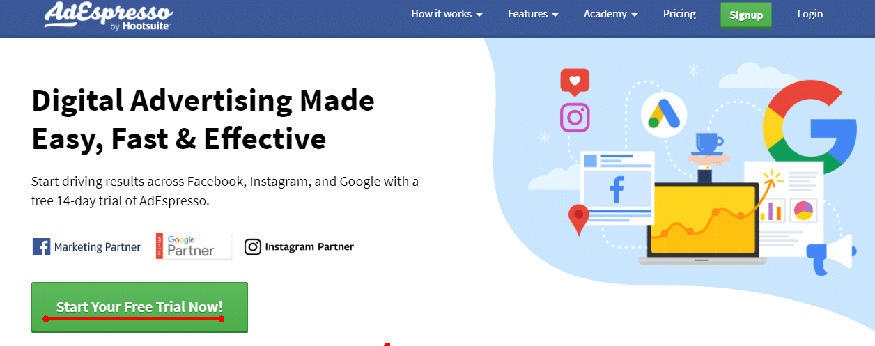
- Add an actionable CTA (call to action) this one shown below. Explain to users what exact step they should take to start using your product.
Use CTA buttons wisely
Now let’s talk about the call to actions. Experts state that standard CTAs such as “search” or “book now” do not work as effectively as they worked before.
Today, if you want to succeed, you should come up with a catchy CTA that will perfectly appeal to your target audience. You should find the right words that make your prospective customers carry out an action.
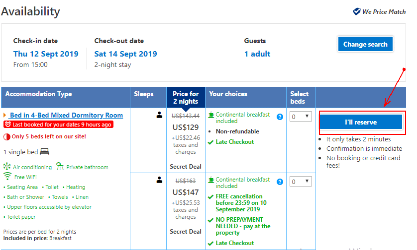
Let’s consider one simple to understand how it works. Most booking services still use standard search CTA buttons that look like this one shown below.
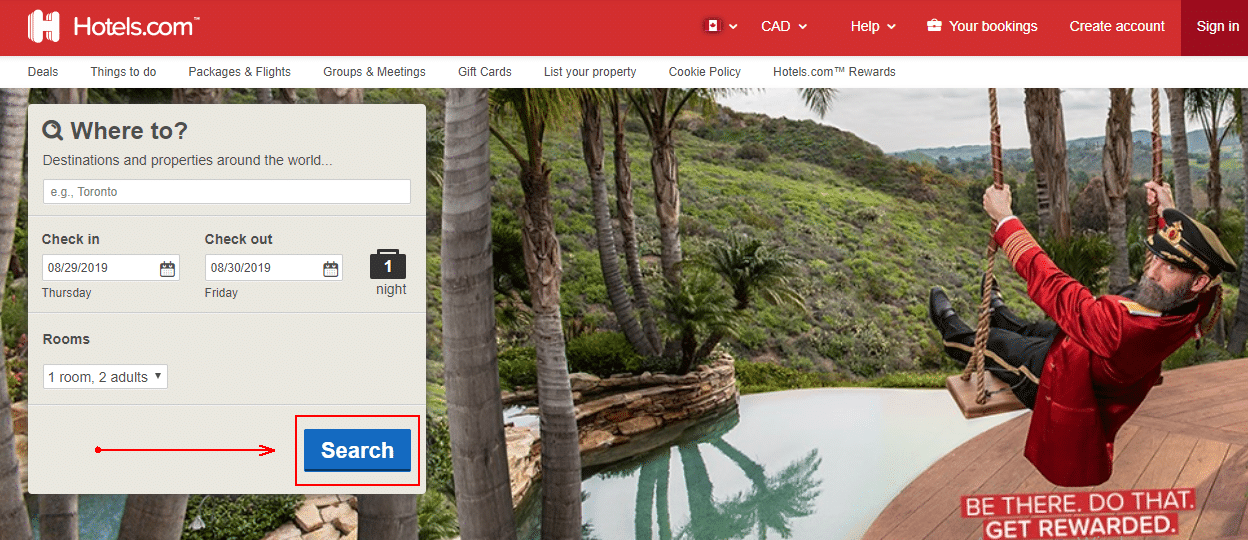
But some companies decided to use more appealing CTAs. For instance, HostelWord, a booking service that targets young, active backpackers, substituted the word “Search” with the phrase “Let’s go!”. It helped the company to engage the audience and increase conversions. this one shown below-
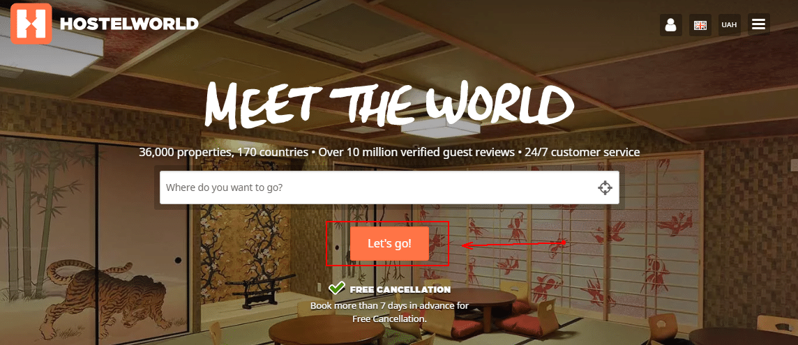
So if you want to choose the right CTA, do the following:
- Define who your audience is, and what preferences and interests it has.
- Choose the words that resonate with your target audience the most.
- Run A/B testing to find out how users react to the chosen CTAs.
Personalize your message
The rule of success is simple: put users first, and they will reward you with a high conversion rate. When you are working on the UX design of your website, think about the elements you can use to make your visitors feel special and valued. Try to create a personalized experience, and you will be amazed by the results.
There are many approaches to personalize user experience, and you should choose that very approach that fits your company. Here are a few ideas you can implement:
- Refer to your customer in the first person. It will help you to smooth communication with your prospective buyers.
- Use the word “I”. It will make a visitor believe that he presses the CTA button on his/her own will.
- If necessary, group your target audience by demographics, segment, interests, or past behaviors.
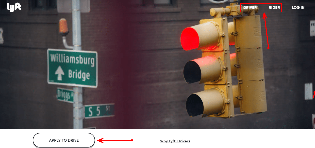
Use fluency psychology
Do you know what “cognitive fluency” is? Explained in plain words, cognitive fluency describes how easily the human brain can process certain information to understand it.
Cognitive fluency is a psychological principle that you should use in UX design. You should have a good understanding of that clear fonts are easy on the brain, while quirky typography is not. Short paragraphs stimulate fluency, while huge blocks of text do not. Well-known words are easy to comprehend, while rarely-used terms are not.
Simplicity is one of the most important trends in UX design, and you should keep up with this trend. To boost the effectiveness of your UX copies, do the following:
- Keep sentences as short as possible. It’s better to write two short sentences instead of a long one.
- Don’t overuse complex verb tenses. For instance, use present perfect tense instead of perfect continuous, if possible (e.g., substitute “has been developing” with “has developed”).
- Don’t overuse passive voice. (e.g., write “we designed a product” instead of “product was designed by us”).
- Eliminate unnecessary words.
- Proofread your copies using a paper writing website or online grammar checkers.
Embrace your brand’s image
Your website should support the image of your brand. It’s important because if the UX design does not correspond with the concept of the brand, the site becomes worthless. If you want to create a website that presents your brand in the most favorable light, do the following:
- Place the logo at the top of the page. And don’t customize it. Otherwise, it may confuse your customers.
- Use the same fonts as you use in your app, newsletters, etc.
- Use the color scheme of your brand. You can change the shade, only if it affects the readability. For instance, if the color of your brand is electric pink, it’s better to use ordinary pink as a dominant color of your site.
- Set the relevant tone of voice. Decide what writing style appeal to your target audience the most, and whether it’s appropriate to use slang, acronyms, and professional jargon.
Takeaway: UX trends you should implement today
If you want to improve the UX design of your website right now, don’t hesitate to apply the tips given. It will allow you to boost the conversions and achieve all the goals you want.You can also Hire MageComp’s Dedicate Graphics Designer to get creative stuff. And keep in mind that new trends appear every day. Keep watching them to keep your website up to date. If you have more ideas to share with us, don’t forget to add into below comment sections.


