
Flutter is a popular UI toolkit that allows developers to create beautiful, natively compiled applications for mobile, web, and desktop from a single codebase. One of the key components of Flutter’s rich widget library is the Card widget. This widget is essential for building visually appealing user interfaces that follow the material design principles.
What is the Card Widget in Flutter?
The Card widget is a material design component that represents a card-like UI element. It serves as a container for related content and actions about a single subject. Cards are great for presenting information in a structured way, making them an excellent choice for displaying images, text, buttons, and other widgets.
Key Features of the Card Widget in Flutter:
- Elevation: Cards come with a default elevation property that gives them a shadow effect, making them appear raised above the background. This elevation can be customized, allowing you to create a sense of depth in your UI.
- Shape: The Card widget supports rounded corners and custom shapes through the shape property. You can use various shapes, such as rectangles with rounded corners, to fit your app’s design.
- Margin and Padding: Control the spacing around the card using the margin property and the spacing inside the card using padding. This ensures that the content is neatly organized.
- Child: A Card can contain a single child widget, which can be anything from text and images to buttons or complex layouts. This flexibility makes it easy to create rich content within the card.
- Color: You can customize the background color of the card using the color property, allowing you to align it with your app’s theme.
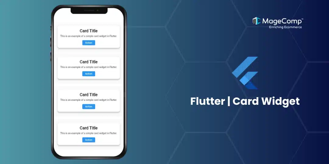
Example of Card Widget in Flutter:
import 'package:flutter/material.dart';

void main() {
  runApp(MyApp());
}

class MyApp extends StatelessWidget {
  @override
  Widget build(BuildContext context) {
    return MaterialApp(
      home: Scaffold(
        appBar: AppBar(title: Text('Flutter Card Example')),
        body: Center(
          child: Card(
            elevation: 8,
            shape: RoundedRectangleBorder(
              borderRadius: BorderRadius.circular(12),
            ),
            margin: EdgeInsets.all(16),
            child: Padding(
              padding: EdgeInsets.all(16),
              child: Column(
                mainAxisSize: MainAxisSize.min,
                children: [
                  Text(
                    'Card Title',
                    style: TextStyle(fontSize: 24, fontWeight: FontWeight.bold),
                  ),
                  SizedBox(height: 8),
                  Text('This is an example of a simple card widget in Flutter.'),
                  SizedBox(height: 16),
                  ElevatedButton(
                    onPressed: () {
                      // Handle button press
                    },
                    child: Text('Action'),
                  ),
                ],
              ),
            ),
          ),
        ),
      ),
    );
  }
}
Use Cases for the Card Widget:
The Card widget is suitable for various use cases, including but not limited to:
- Product Listings: Display individual products with images, titles, and prices.
- News Feeds: Showcase articles or posts in a scrollable list.
- User Profiles: Present user information, such as name, picture, and bio, inside a card.
- Actionable Items: Use cards to highlight tasks, reminders, or notifications with action buttons.
Tips for Using Cards Effectively:
- Consistent Padding & Margins: Ensure that your cards maintain consistent padding and margins across the app for a polished look.
- Avoid Over-Elevation: Using too much elevation can result in overly pronounced shadows, which may not always suit your design. Stick to subtle shadows for a clean, modern UI.
- Group Related Content: Cards are ideal for grouping related content, but avoid cramming too much information into a single card. Instead, break content into multiple cards for readability.
Conclusion
The Card widget in Flutter is a powerful tool for designing beautiful and structured layouts that follow material design principles. With its versatility in customization and ease of use, it’s a go-to widget for organizing content and improving the visual aesthetics of your app.
By mastering the Card widget, you can create visually appealing UIs that enhance user engagement and improve your app’s overall experience. Give it a try in your next Flutter project, and elevate your UI design effortlessly!