The homepage is often the first touchpoint users have with your brand. Your Shopify store’s homepage is more than just a virtual storefront—it’s the digital gateway to your brand’s success. As potential customers land on your homepage, the design and functionality become paramount in shaping their perception and driving conversions.
Let’s explore 10 outstanding examples of Shopify homepage designs that stand out for their creativity, effectiveness, and unique approaches.
Best 10 Examples of Inspirational Shopify Homepage Designs
1. Mad Tasty
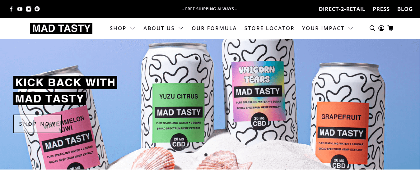
Mad Tasty, a beverage brand, features a homepage with refreshing colors and engaging visuals. Look for clear CTAs, possibly promoting new products or ongoing promotions.
Mad Tasty’s homepage uses high contrast and colorful photography with a casual tone, reflecting its brand personality. Detailed information is strategically placed, preventing overwhelming visitors with too much information upfront. The homepage features easy access to information crucial for potential customers, facilitating informed purchase decisions.
2. Chämpo
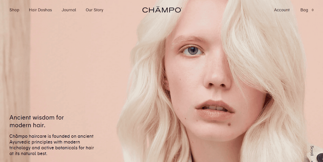
As a haircare brand, Chämpo‘s homepage design showcases luxurious and visually appealing product imagery. Expect a design that communicates the brand’s commitment to quality and natural ingredients.
Chämpo’s design educates visitors about Ayurvedic principles, employing a clear CTA to guide them through a personalized quiz. The quiz helps understand the visitor’s needs, enhancing personalization and reducing returns. A well-placed call-to-action directs visitors to the quiz, showcasing the brand’s commitment to personalized customer experiences.
3. Raw
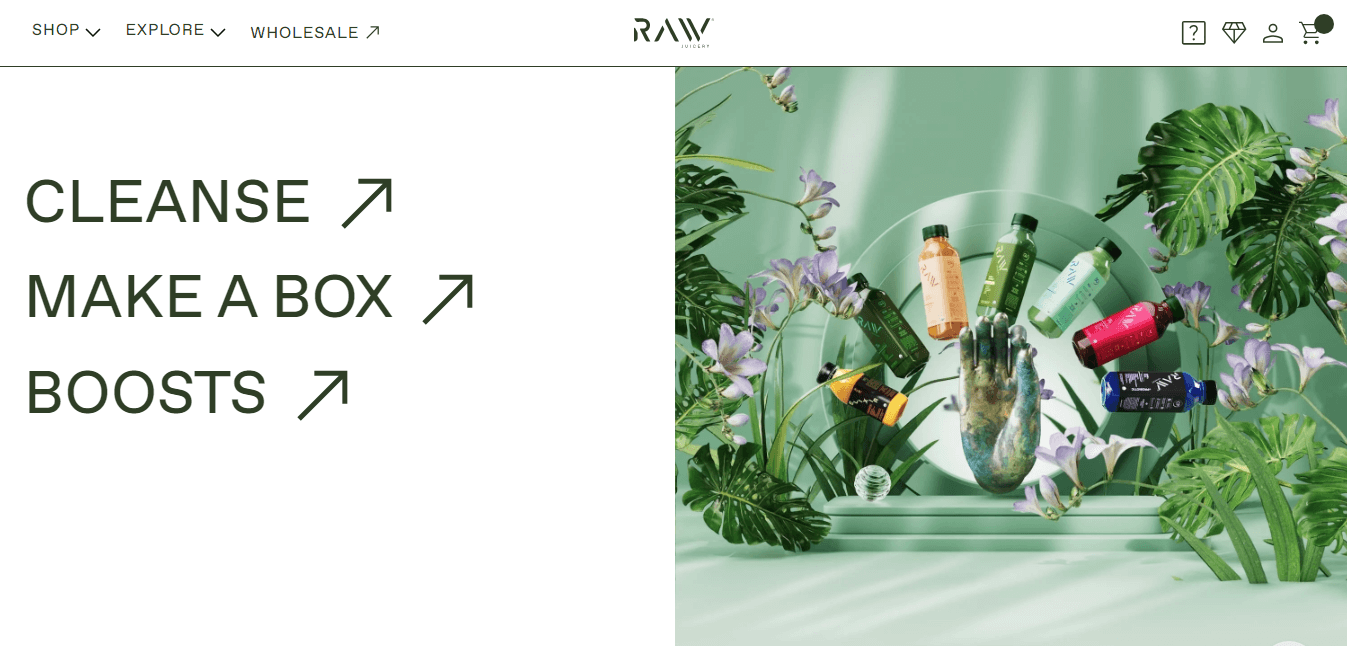
Raw, a juice brand, has a homepage that reflects the latest trends. Look for a combination of high-quality images, perhaps a lookbook or featured collections, and an easy-to-navigate layout.
Raw Juicery uses a clean design with a spa-like color palette, creating a serene browsing experience. Social proof and benefits of the subscription model are highlighted, adding exclusivity for members. The homepage lists benefits upon scroll, emphasizing the advantages of the subscription model and encouraging loyalty.
4. Magnolia Bakery
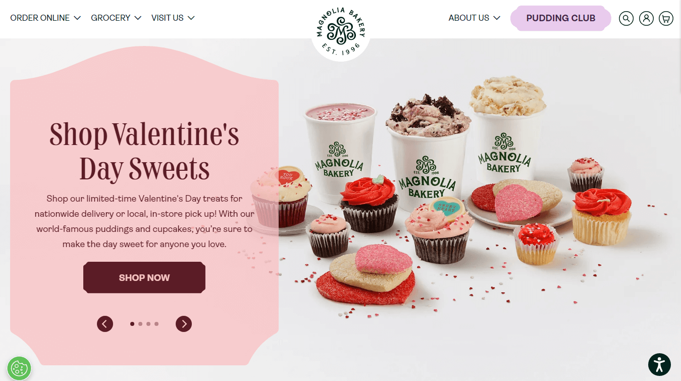
For a bakery, the Magnolia Bakery website features a warm and inviting design. Look for mouth-watering visuals of their baked goods, with a focus on seasonal treats or promotions.
Magnolia Bakery’s homepage transports visitors into a delightful world of baked goods through expertly photographed visuals. Dedicated sections outline delivery options, catering to customers with multiple sales channels. Since customers can’t taste the products online, Magnolia Bakery relies on captivating photography to spark customers’ imagination.
5. Thaely
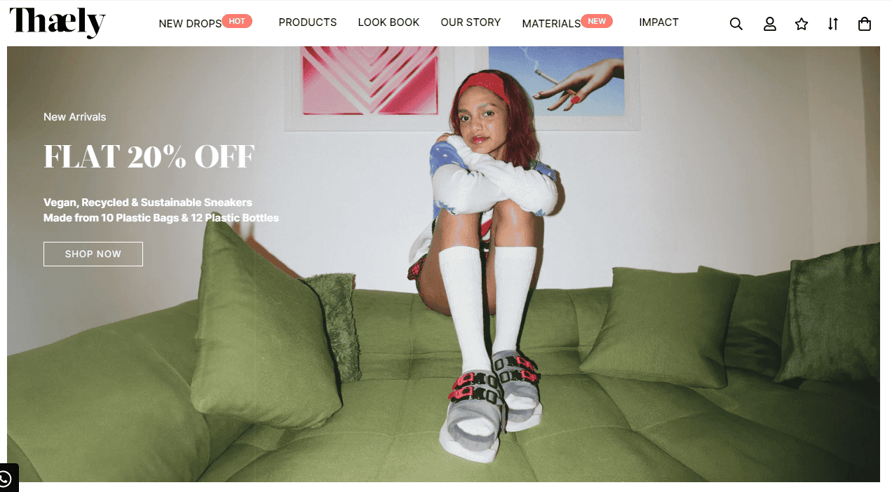
Thaely, being a footwear brand, employ a clean and elegant design. Look for a homepage that emphasizes product benefits, customer testimonials, and a soothing color palette.
Thaely’s homepage prioritizes design and brand aesthetics, using lifestyle photography to showcase sustainable and fashionable footwear. Ethical manufacturing and sustainability are transparently communicated, appealing to conscious and fashion-forward consumers. Thaely utilizes social proof through user-generated content, enhancing purchase confidence and connecting with younger consumers.
6. Rocco
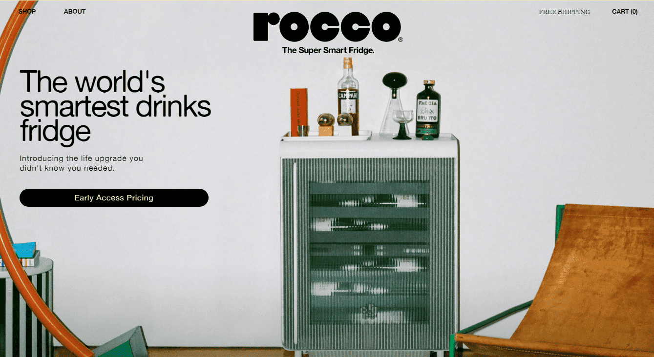
Rocco has a homepage design that aligns with its brand persona. Expect bold visuals, clear messaging, and possibly interactive elements to engage visitors.
Rocco’s homepage relies on modern lifestyle photography, immersing visitors in aspirational home design. Clear copy, like “world’s smartest,” positions the product as innovative and distinct. To assist visitors new to the concept, Rocco provides information on the product’s benefits and showcases press coverage for added trust.
7. Stakt
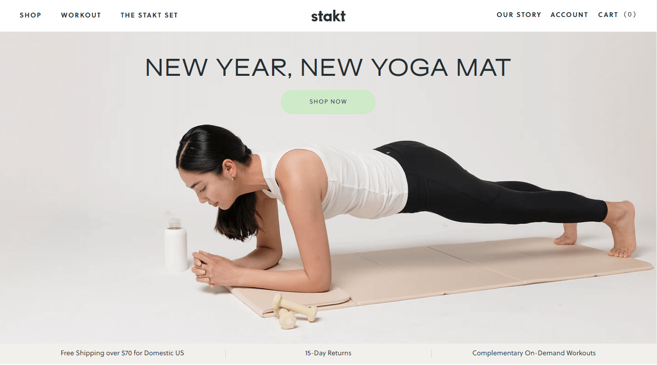
Stakt showcases a well-organized homepage with appealing visuals of their products in different settings. Look for simplicity and functionality in design.
Stakt’s homepage uses soft tones associated with mindfulness, attracting its target customer base. The inclusion of free content promotes community-building, offering additional value beyond the product. Stakt strategically promotes free resources on the homepage, inviting customers into a community and aiding first-timers on their fitness journey.
8. Plastno
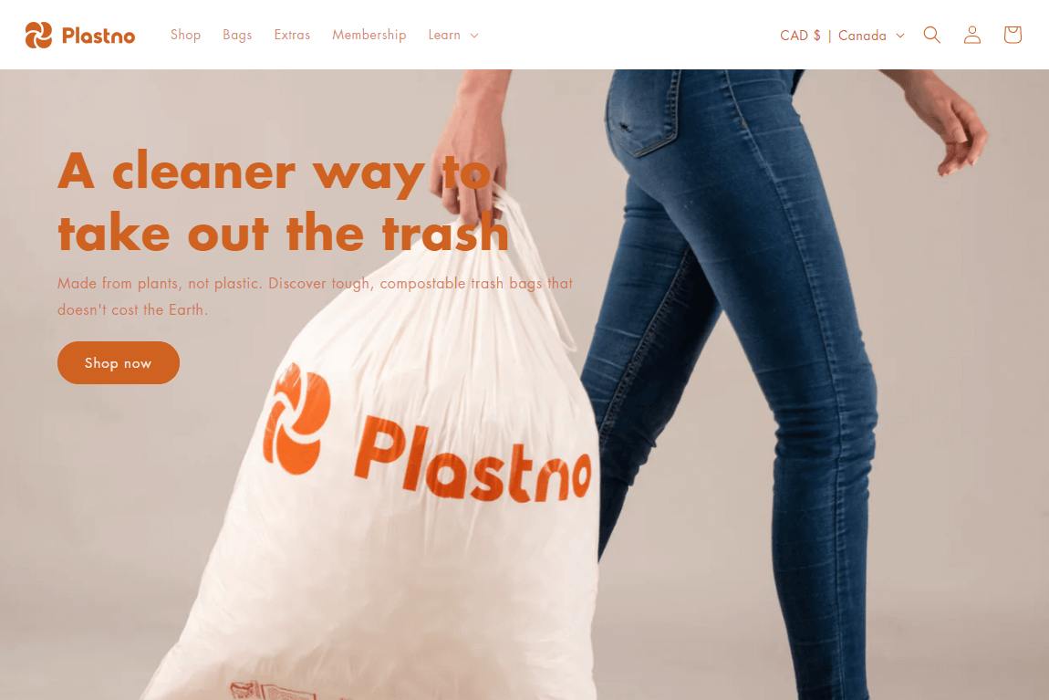
For a brand like Plastno, which is related to sustainable products, the homepage features eco-friendly imagery and messaging. Look for a design that communicates the brand’s commitment to environmental responsibility.
Plastno’s homepage focuses on its compostable alternative to plastic, appealing to conscious consumers. Timed pop-ups offer deals, converting even skeptical shoppers and encouraging engagement. Strategically timed pop-ups offer discounts, providing an additional incentive for visitors to explore and make a purchase.
9. Lyka
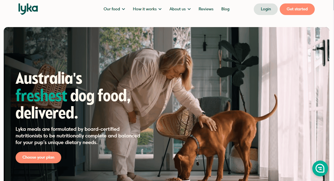
Lyka, a pet care brand, has a homepage with adorable pet images and a friendly design. Look for a bright and inviting color scheme with user-friendly layout for easy navigation.
Lyka prioritizes information and imagery that appeals to potential customers, focusing on benefits and features. The homepage dedicates space to case studies, scientific resources, and a meal counter, building trust with customers. A “don’t take our word for it” approach is adopted, showcasing case studies and scientific resources to enhance credibility.
10. HealthyBaby
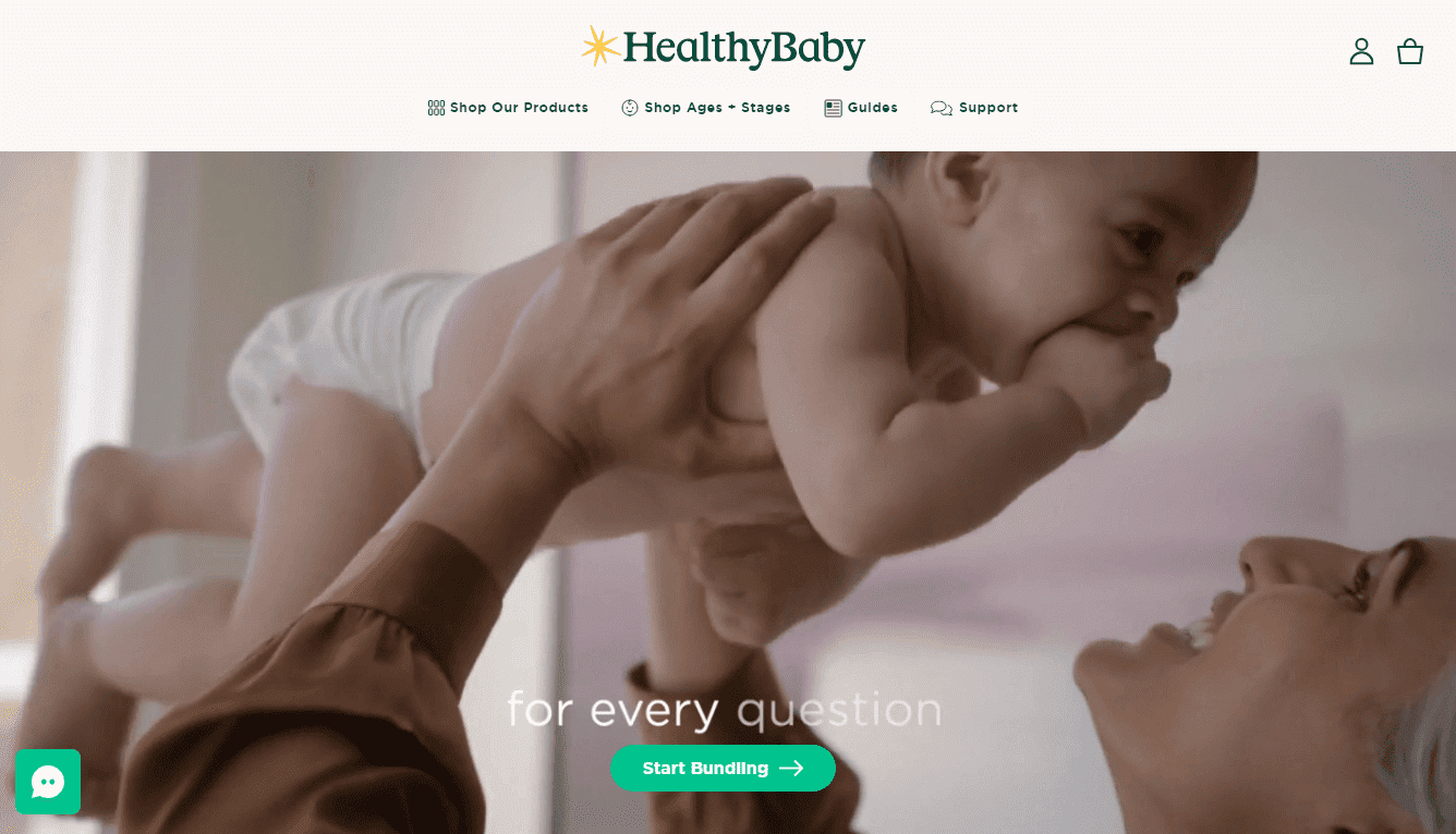
HealthyBaby, a baby care brand, has a soft and calming color palette. The inclusion of educational content related to baby health for parents.
HealthyBaby understands its audience and presents tender moments between babies and parents through video. The homepage promotes content, a competitive advantage, and provides a preview of HealthyBaby guides. Using video, HealthyBaby creates an emotional connection with parents, drawing them in and reflecting the brand’s focus on safe and natural baby essentials.
Final Say:
In conclusion, these 1o Shopify homepage design examples demonstrate a diverse range of strategies and creative approaches. Whether it’s direct communication, education, lifestyle imagery, or transparency, each brand effectively leverages its unique selling points to create compelling and memorable online experiences. As you embark on designing or revamping your Shopify store’s homepage, draw inspiration from these examples and tailor the principles to align with your brand identity and target audience.
Hire a Shopify Developer to customize the homepage design of your Shopify store.


