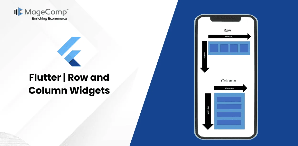
Flutter, as a modern UI toolkit, allows developers to build beautiful, high-performance apps with a single codebase for mobile, web, and desktop. Among the most fundamental widgets in Flutter are the Row and Column widgets, which are essential for laying out child widgets in horizontal and vertical orientations, respectively. Understanding how to use these widgets effectively can significantly improve your app’s design and responsiveness.
What Are Row and Column Widgets?
The rows and columns are not a single widget; they are two different widgets, namely Row and Column. The Row widget arranges its children in a horizontal direction, while the Column widget aligns its children vertically. Both widgets are core layout building blocks, enabling developers to create complex layouts by nesting and combining them with other widgets.
Here, we will integrate these two widgets together because they have similar properties that help us understand them efficiently and quickly.0
Key Points
- Row and Column widgets are the most commonly used layout patterns in the Flutter application.
- Both may take several child widgets.
- A child widget can also be a row or column widget.
- We can stretch or constrain a particular children’s widget.
- Flutter also allows developers to specify how child widgets can use row and column widgets’ available space.
Using the Row Widget
The Row widget displays its children from left to right. It’s ideal for creating horizontal layouts. Here’s a basic example:
Example:
import 'package:flutter/material.dart';

void main() {
  runApp(MyApp());
}

class MyApp extends StatelessWidget {
  @override
  Widget build(BuildContext context) {
    return MaterialApp(
      home: Scaffold(
        appBar: AppBar(title: Text('Row Example')),
        body: Row(
          mainAxisAlignment: MainAxisAlignment.center,
          children: <Widget>[
            Container(color: Colors.red, width: 50, height: 50),
            SizedBox(width: 20),
            Container(color: Colors.green, width: 50, height: 50),
            SizedBox(width: 20),
            Container(color: Colors.blue, width: 50, height: 50),
          ],
        ),
      ),
    );
  }
}
Using the Column Widget
The Column widget arranges its children vertically. It’s perfect for stacking widgets on top of each other. Here’s a basic example:
Example:
import 'package:flutter/material.dart';

void main() {
  runApp(MyApp());
}

class MyApp extends StatelessWidget {
  @override
  Widget build(BuildContext context) {
    return MaterialApp(
      home: Scaffold(
        appBar: AppBar(title: Text('Column Example')),
        body: Column(
          mainAxisAlignment: MainAxisAlignment.center,
          children: <Widget>[
            Container(color: Colors.red, width: 50, height: 50),
            SizedBox(height: 20),
            Container(color: Colors.green, width: 50, height: 50),
            SizedBox(height: 20),
            Container(color: Colors.blue, width: 50, height: 50),
          ],
        ),
      ),
    );
  }
}
Combining Rows and Columns
import 'package:flutter/material.dart';

void main() {
  runApp(MyApp());
}

class MyApp extends StatelessWidget {
  @override
  Widget build(BuildContext context) {
    return MaterialApp(
      home: Scaffold(
        appBar: AppBar(title: Text('Nested Rows and Columns')),
        body: Column(
          children: <Widget>[
            Row(
              mainAxisAlignment: MainAxisAlignment.spaceAround,
              children: <Widget>[
                Container(color: Colors.red, width: 50, height: 50),
                Container(color: Colors.green, width: 50, height: 50),
                Container(color: Colors.blue, width: 50, height: 50),
              ],
            ),
            SizedBox(height: 20),
            Column(
              crossAxisAlignment: CrossAxisAlignment.start,
              children: <Widget>[
                Container(color: Colors.yellow, width: 50, height: 50),
                SizedBox(height: 20),
                Container(color: Colors.purple, width: 50, height: 50),
              ],
            ),
          ],
        ),
      ),
    );
  }
}
Conclusion
Mastering the Row and Column widgets in Flutter is essential for creating dynamic and responsive layouts. By understanding their properties and how to nest them effectively, you can build complex and adaptive UIs. Experiment with different layouts and properties to find what works best for your application.


