
With the growing popularity of dark mode in mobile applications, supporting it in your React Native app is more important than ever. Dark mode not only enhances the user experience but also saves battery life on OLED screens and can reduce eye strain in low-light environments.
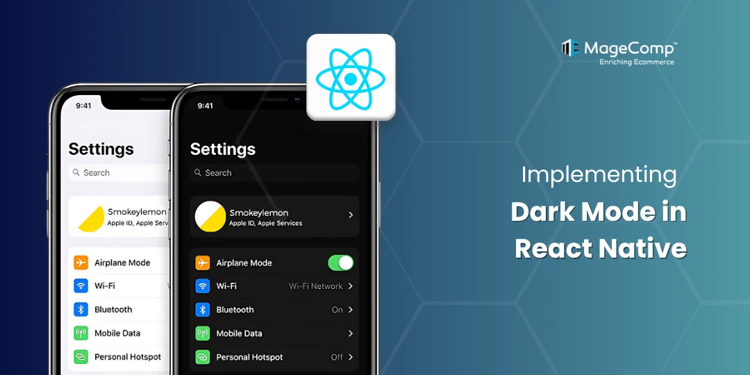
Dark mode allows your app to switch between light and dark themes, improving user experience and accessibility. React Native provides built-in APIs to detect the system’s appearance settings and tools to manage custom themes.

Why Implement Dark Mode in React Native?
- Better accessibility and visual comfort in low light
- Improved battery efficiency on OLED screens
- Aligns with user preferences
- Modern UI trend followed by Android and iOS
Ways to Implement Dark Mode in React Native:
There are two primary ways to implement dark mode in React Native:
Method 1: System-Based Dark Mode
Detect the device’s appearance (light/dark) using Appearance or useColorScheme from React Native.
Using Appearance
import React from 'react';
import { View, Text, useColorScheme } from 'react-native';

const App = () => {
  const theme = useColorScheme();
  const isDarkTheme = theme === 'dark';

  return (
      <View
          style={[
            {
              flex: 1,
              justifyContent: 'center',
              alignItem: 'center',
            },
            isDarkTheme
              ? { backgroundColor: 'black' }
              : { backgroundColor: 'white' },
          ]}>
          <Text style={[isDarkTheme ? { color: 'white' } : { color: 'black' }]}>
            This is demo of default dark/light theme using appearance.{' '}
          </Text>
     </View>
  );
}

export default App;
Method 2: Manual Theme Switching
Allow users to toggle between light, dark, or system-based themes using state management.
Step 1: Create a Theme Context
// ThemeContext.js
import React, { createContext, useContext, useState, useEffect } from 'react';
import { Appearance } from 'react-native';
import { themes } from './theme';

const ThemeContext = createContext();

export const ThemeProvider = ({ children }) => {
  const [themeMode, setThemeMode] = useState('system'); // 'system', 'light', or 'dark'
  const [currentTheme, setCurrentTheme] = useState(themes.light);

  useEffect(() => {
    const updateTheme = () => {
      const systemTheme = Appearance.getColorScheme() || 'light';
      if (themeMode === 'system') {
        setCurrentTheme(themes[systemTheme]);
      } else {
        setCurrentTheme(themes[themeMode]);
      }
    };

    updateTheme();
    const subscription = Appearance.addChangeListener(updateTheme);
    return () => subscription.remove();
  }, [themeMode]);

  const toggleTheme = (mode) => {
    setThemeMode(mode);
  };

  return (
    <ThemeContext.Provider value={{ theme: currentTheme, themeMode, toggleTheme }}>
      {children}
    </ThemeContext.Provider>
  );
};

export const useTheme = () => useContext(ThemeContext);
Step 2: Wrap App with ThemeProvider
// App.js
import React from 'react';
import { View, Text, Button, StyleSheet } from 'react-native';
import { ThemeProvider, useTheme } from './ThemeContext';

const MainScreen = () => {
  const { theme, themeMode, toggleTheme } = useTheme();

  return (
    <View style={[styles.container, { backgroundColor: theme.background }]}>
      <Text style={{ color: theme.text }}>
        Current theme: {themeMode}
      </Text>
      <Button title="Light Mode" onPress={() => toggleTheme('light')} />
      <Button title="Dark Mode" onPress={() => toggleTheme('dark')} />
      <Button title="System Mode" onPress={() => toggleTheme('system')} />
    </View>
  );
};

const App = () => (
  <ThemeProvider>
    <MainScreen />
  </ThemeProvider>
);

const styles = StyleSheet.create({
  container: {
    flex: 1,
    justifyContent: 'center',
    alignItems: 'center',
  },
});

export default App;
Step 3: Persist Theme Preference
npm install @react-native-async-storage/async-storageUpdate ThemeContext.js:
// ThemeContext.js
import React, { createContext, useContext, useState, useEffect } from 'react';
import { Appearance } from 'react-native';
import AsyncStorage from '@react-native-async-storage/async-storage';
import { themes } from './theme';

const ThemeContext = createContext();

export const ThemeProvider = ({ children }) => {
  const [themeMode, setThemeMode] = useState('system');
  const [currentTheme, setCurrentTheme] = useState(themes.light);

  useEffect(() => {
    // Load saved theme preference
    const loadTheme = async () => {
      const savedTheme = await AsyncStorage.getItem('themeMode');
      if (savedTheme) {
        setThemeMode(savedTheme);
      }
    };
    loadTheme();
  }, []);

  useEffect(() => {
    const updateTheme = () => {
      const systemTheme = Appearance.getColorScheme() || 'light';
      const selectedTheme = themeMode === 'system' ? systemTheme : themeMode;
      setCurrentTheme(themes[selectedTheme]);
      AsyncStorage.setItem('themeMode', themeMode); // Save preference
    };

    updateTheme();
    const subscription = Appearance.addChangeListener(updateTheme);
    return () => subscription.remove();
  }, [themeMode]);

  const toggleTheme = (mode) => {
    setThemeMode(mode);
  };

  return (
    <ThemeContext.Provider value={{ theme: currentTheme, themeMode, toggleTheme }}>
      {children}
    </ThemeContext.Provider>
  );
};

export const useTheme = () => useContext(ThemeContext);
Step 4: Styling Components with Themes
/ components/ThemedButton.js
import React from 'react';
import { TouchableOpacity, Text, StyleSheet } from 'react-native';
import { useTheme } from '../ThemeContext';

const ThemedButton = ({ title, onPress }) => {
  const { theme } = useTheme();

  return (
    <TouchableOpacity
      style={[styles.button, { backgroundColor: theme.primary }]}
      onPress={onPress}
    >
      <Text style={[styles.text, { color: theme.text }]}>{title}</Text>
    </TouchableOpacity>
  );
};

const styles = StyleSheet.create({
  button: {
    padding: 10,
    borderRadius: 5,
    margin: 5,
  },
  text: {
    textAlign: 'center',
  },
});

export default ThemedButton;

// App.js (MainScreen)
import React from 'react';
import { View, Text, StyleSheet } from 'react-native';
import ThemedButton from './components/ThemedButton';
import { useTheme } from './ThemeContext';

const MainScreen = () => {
  const { theme, themeMode, toggleTheme } = useTheme();

  return (
    <View style={[styles.container, { backgroundColor: theme.background }]}>
      <Text style={{ color: theme.text }}>
        Current theme: {themeMode}
      </Text>
      <ThemedButton title="Light Mode" onPress={() => toggleTheme('light')} />
      <ThemedButton title="Dark Mode" onPress={() => toggleTheme('dark')} />
      <ThemedButton title="System Mode" onPress={() => toggleTheme('system')} />
    </View>
  );
};
Conclusion:
With just a few lines of code, you can give your users control over how your app looks, offer a modern user experience, and align with platform standards. If you find any difficulty, let me know through the comment section.
FAQ
- Does dark mode work on all Android and iOS devices?
Dark mode is officially supported on Android 10+ and iOS 13+. Devices with earlier versions won’t support system-based dark mode detection.
- Can I combine system dark mode with manual switching?
Yes. The best approach is to default to the system preference (useColorScheme()), and override it if the user selects a theme manually (store it in state and optionally persist it).