Hello Friends,
Add to Cart Button is the main interaction point of customers with you. This button must force the visitor to take action. E-commerce sites make money when the customers hit the Add to Cart button. As a marketer or E-commerce business owner you must grab as many people as possible to hit that button. You can use Magento 2 Sticky Add to Cart for attracting visitors to hitting that button.
With so much effectiveness of a single button, it is important to make sure if the buttons are working, performing well, and encouraging people to proceed for checkout.
So how can you do that?
The most effective way to optimize your Add to Cart buttons is by picking the right size, placement, and color. Size and placement are crucial for the conversion process. Changing the color of Add to Cart buttons can significantly change the conversion rates of your business.
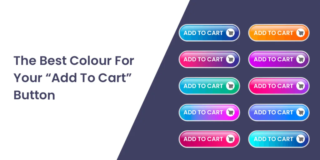
Are your Add to Cart buttons promoting customers for click? Or are your Add to Cart buttons pulling customers away? This article will discuss the best color for your “Add to Cart” button to improve your website’s shopping experience.
The Best Colour For Your “Add To Cart” Button
The Add to Cart button must integrate with the color shades of your website. Here is what each color represents.
Red
Red is a passionate color and creates a sense of urgency and excitement. It also brings hunger in buyers and stands out on web pages. If you want customers to take quick action, then red is the best color. Red is also the popular color for the food category websites.
Image Source: AB Tasty
Green
Websites selling products related to the environment, peace, or psychology then green is the best color for your Add to Cart button. Green is a calm color and it represents “Go”. It becomes mentally easier for customers to click on the Green Add to Cart button instead of other colors.
Image Source: Theme Forest
Yellow or Orange
Yellow and orange are eye-catchy and offer a sense of happiness and warmth. So, if the customer is happy they are higher chances of a customer clicking the Add to Cart button. Yellow and Orange color buttons are used to make customers feel better about their purchases.
Image Source: Business 2 Community
Blue
Blue signals trust. It is popular amongst B2B websites and communication agencies. Blue color conveys the message of trustworthiness.
Image Source: Pod1
Black
Black color represents luxury. Top brands use black color for their Add to cart button. Black is the most popular choice for fashion and clothing websites.
Image Source: Bazaar voice
Final Say:
The best converting colors depend on your business and audience. No one color would work for all the websites. You can even try A/B testing to find the best-converting color for your website. To keep in mind while choosing the color of your Add to Cart button, make sure the button color contrasts with the background color of your website.
The answer for which is the best color for the Add to Cart button is different for all. Based on the layout of your website and the audience’s psychology, you need to try a number of combinations to find which color works well for you.
You can even add customizations with Add to Cart Button like hiding Add to Cart Button for Guest Users.
Which color do you use for your E-commerce website? Let us know in the comment
Happy Reading
